Do you want to increase you ecommerce conversion rate? We have listed down the most effective and proven tactics to improve ecommerce conversion rate.
Let’s say you’re the owner of a shopping mall. Each time you visit – whether on holiday or even a weekday – the mall seems to be swarming with visitors. Surely, the mall must be doing great business, right?
Surprisingly, the monthly sales numbers demonstrate a completely bleak picture with sales being at an all-time low. In fact, the only thing that seems to be rising is the volume of ‘window shoppers.’ Sounds familiar?
Drawing comparisons in the e-commerce universe, it’s like a user who logs onto your website browses through the offerings, but does not end up buying anything. When this happens over and over, you know your business is experiencing a low ‘conversion rate.’ It’s time to look into conversion optimization tactics to improve the conversion rate.
Conversion Rate = Sessions with Transactions / Total Sessions
If you’re wondering why customers don’t make the leap of faith – or in this case – click a button, keep reading. You’ll be surprised to know that the switch from ‘click to conversion’ can be plagued by numerous factors such as:
- Absence of radical testing leading to confused customers:
Around 48% of companies don’t test their landing pages. If the offerings aren’t crystal-clear to the customer, you can rest assured that the sale will never happen. - Static elements on the page and a dull UI:
Integrating too many pop-ups, making the website text-heavy, and using a complex layout is simple no-go’s you need to be aware of. Using an attractive UI that offers seamless navigation and instilling beautiful imagery and videos can truly help. Data suggest that integrating a video element on your landing page can boost conversion rates by 86%. - Your CTA isn’t visible:
If the customers can’t find the CTA button(s), you’ll never see them again. - The content is outdated and boring:
If the copy on your website doesn’t excite your customers and resonate with them, they’ll never bother buying anything. The mantra “Can’t read, won’t buy” stands as true as ever. - The website isn’t mobile-friendly, and live chat is ‘dead’:
Most users today browse through websites on their mobile, hence the emergence of the ‘App Revolution.’ Plus, if your website isn’t adapting to the current technological needs (think: live chat), the customers will switch to the ones that do. - Lack of Re-engagement:
Online visitors do not buy in a single visit. Similar to offline shopping, visitors browse through various products and leave. You need to re-engage with visitors in an effective and efficient way to bring them back.
These are just some of the reasons why E-Commerce websites fail to capture user attention and retain them. To counter this, here are tried-and-tested strategies you can try:
7 Proven Ways to Sky-Rocket Your E-Commerce Conversion Rates
Make UI Your Prime Focus
If given a choice, would you rather go for those bulky, expensive, and traditional mobile phones over the touch smartphones today? Not a chance!
That’s exactly how customers feel if your website lacks ‘responsiveness,’ is dull and static by design, and offers a downright cumbersome experience. Let’s look at the bad vs good website design for your convenience:
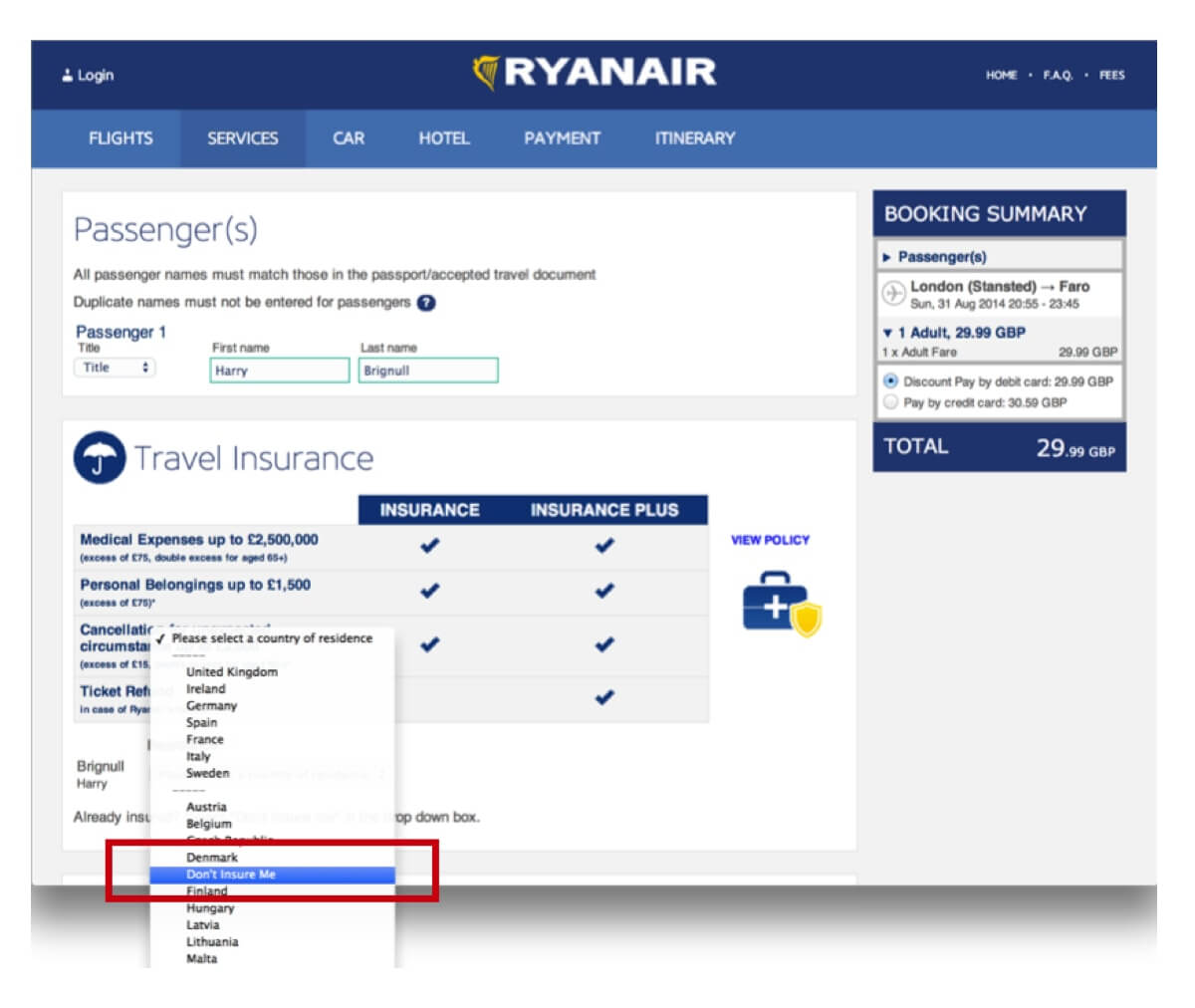
This complicated and confusing UI design by RyanAir is a big turn off:
On the contrary, this clean and minimal website with seamless navigation and a logical UI by Airbnb is all things user-friendly

So, what can you do to get onto the good side of UI designing? To get started, invest more in integrating UI elements across your e-commerce store, such as the following:
• Use a captivating background color as Gucci demonstrates like a BOSS (pun intended):

• Another example to consider is the American e-commerce brand, Peak House:
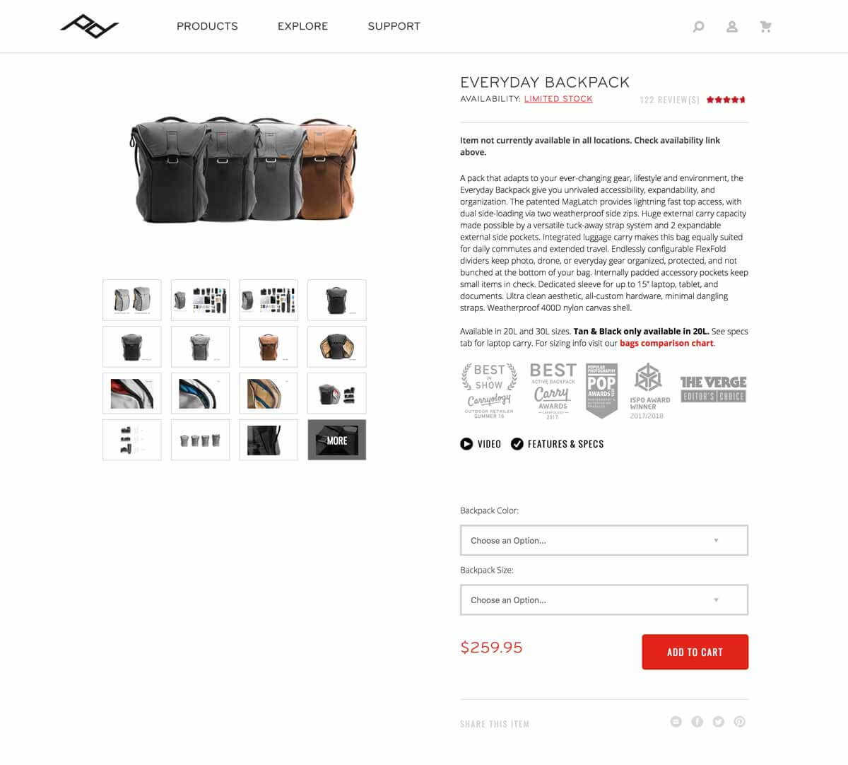
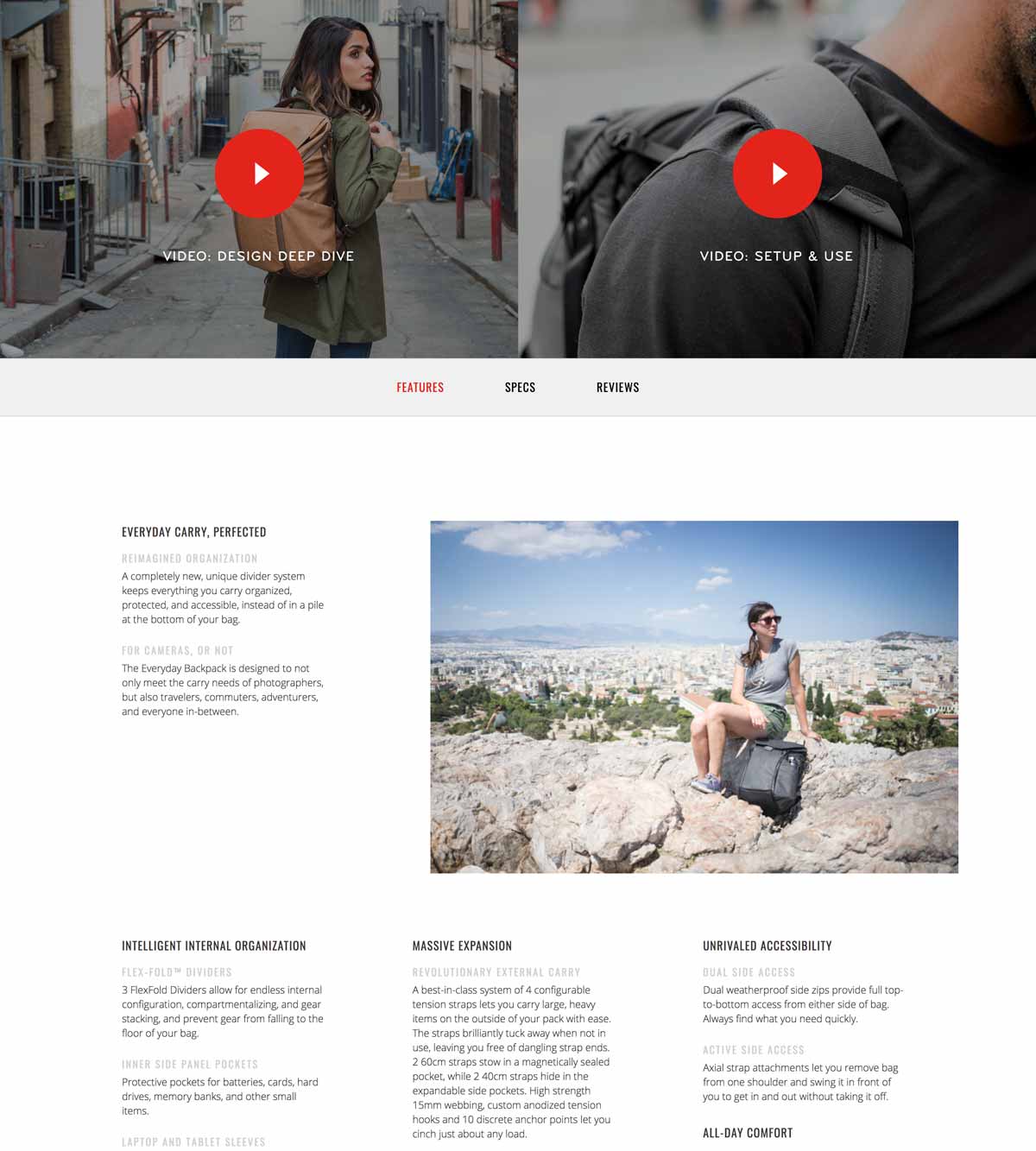
The Takeaway: Customers need to visualize the offerings better, so investing in your UI can be a smart choice – business-wise or otherwise.
Get Onto the SEO Side of Things
SEO is not merely a buzzword anymore. It has known to offer valuable results, such as the following:
As an e-commerce company, you need to work more on the SEO side of things by embracing best practices.
Below is one such example:
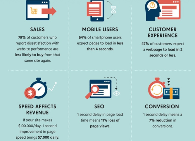
• Improving the website’s speed. Look at the following infographic, which effectively summarizes the importance of page load time optimization.
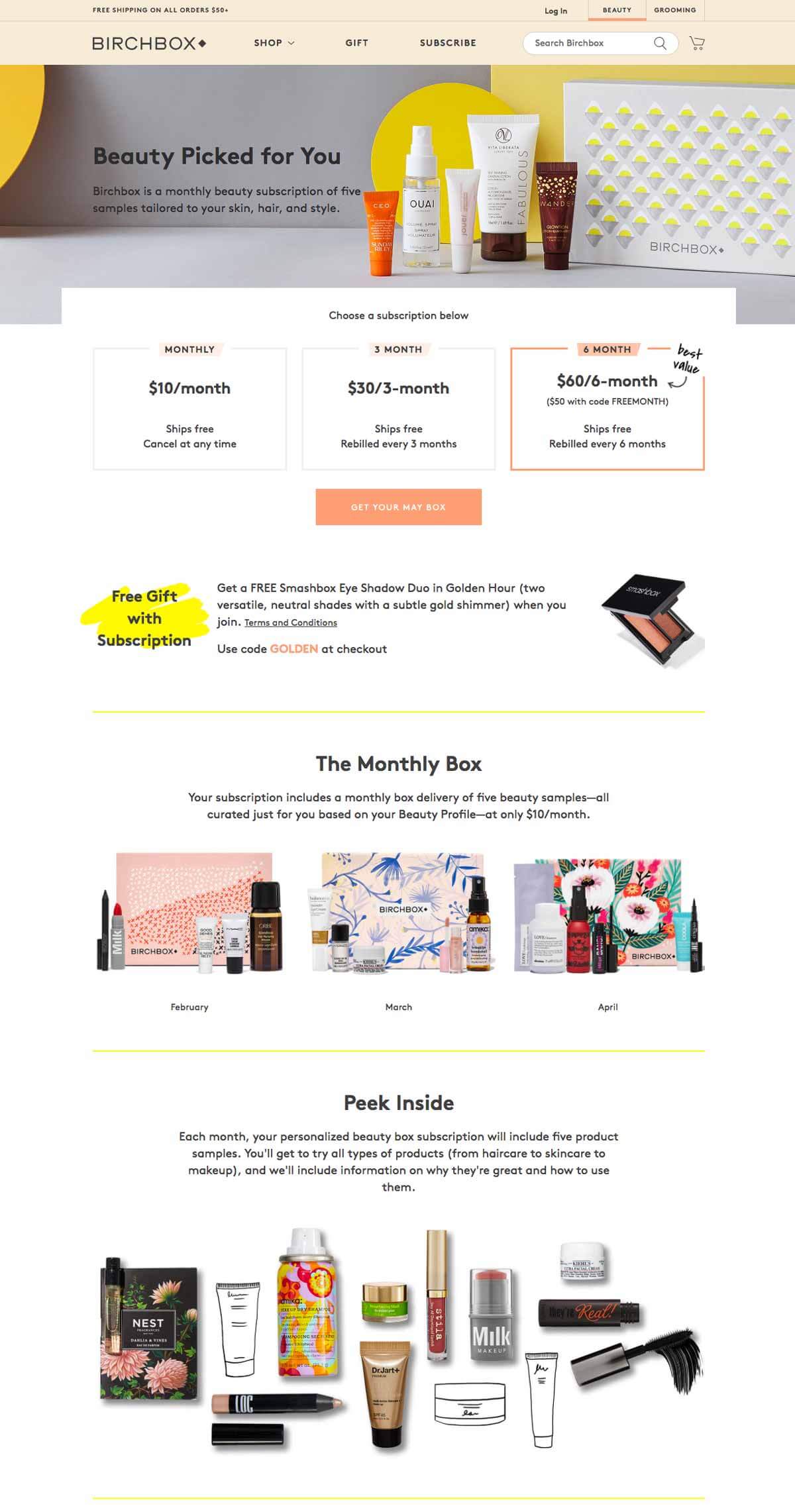
• Implementing dynamic SEO strategies relating to new product additions, updating inventory, and adding 301 redirects. The beauty and make up company Birchbox’s website page effectively showcases its new products. Note how the company showcases products by segregating it into ‘monthly subscriptions’ and provides the user with a 360 view of all the products available by using the ‘Peek Inside’ section:
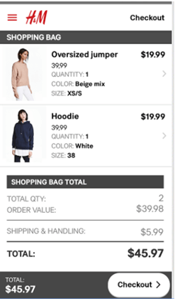
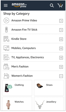
• Ensuring mobile site optimization: H& M and Amazon’s mobile apps are a great example to consider:
Make It Personal (Pun Intended)
In the E-Commerce domain, getting personal may not be a bad move. Confused? Consider the real-time communication technology which offers unique cobrowsing benefits:
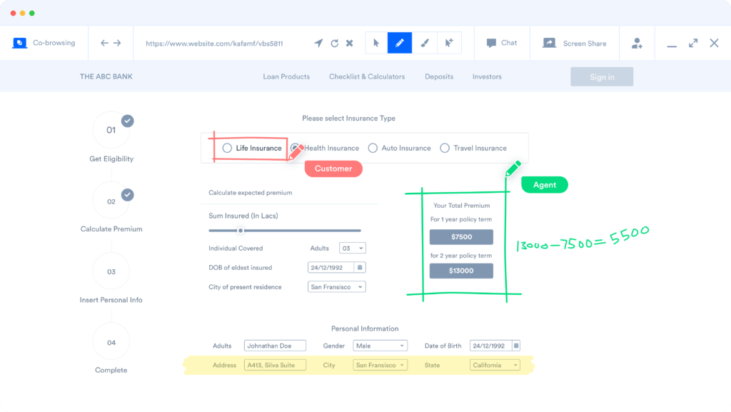
The Core Idea: E-commerce businesses need to deliver personalized customer service by leveraging cobrowse technology to:
• Offer users with a more ‘guided’ customer experience and increases customer satisfaction as well as loyalty.
• Support the buyer in the cases of navigational problems, checkout problems, & payment failures through real-time web screen sharing.
• Enable a faster query resolution and reduce instances of shopping cart abandonment.
• Ultimately boost sales and in turn, ROI for a company.
Champion Customized Emails & Make a Great Impression
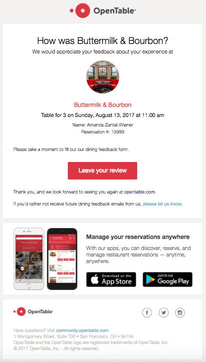
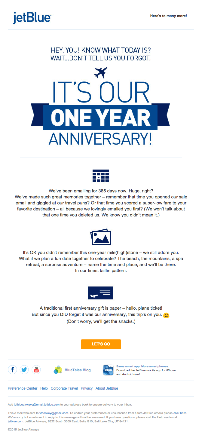
If statistics are anything to go by, the average email opt-in rate stands at 1.95%. While the number seems low, there are plenty of ways to boost customer engagement. One of the most proven ways to do so is by sending customized emails to boost retention and enhance your website’s conversion rate. Brand, JetBlue does this by embracing equal parts creativity and customization:
Another brand Birchbox informs customers about glancing through the user’s past purchase history and sends a personalized email that specifically caters to the user’s needs:

Don’t Be Afraid of Honest Reviews
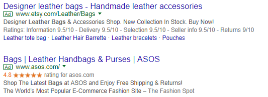
Around 61% of users read online reviews as they wish to make smart, informed buying decisions. You can invite users to add honest and authentic reviews and showcase it on the SERP (Search Engine Results Page):
Image Source
Research shows that including Google reviews to achieve Google Seller Ratings can increase your ECommerce website’s click-through rate by 10% on average!
The Takeaway: You can use a review platform such as TrustPilot and integrate it with your e-commerce store to instil a sense of confidence and trust in your users by allowing the latter to share their experiences on an open platform (such as a Google page):
Keep Your Checkout Process In Check
Going through a painful, information-heavy checkout page is like getting stuck in traffic for 2 hours after a tiring day at work – absolutely excruciating!
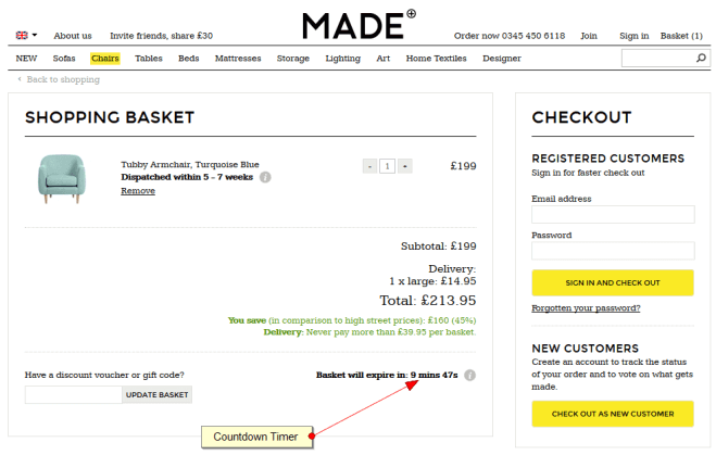
The need of the hour for E-Commerce websites is to implement a smooth, preferably one-stop checkout process including the checkout form such as furniture retailer, Made demonstrates below:
The Takeaway: The last leg of the customer’s buying process is as important as the initial journey. Customers spend a lot of time browsing products; they don’t need to spend more on filling too many details or clicking the next button to ‘neverland.” A one-stop, minimal checkout process can ensure a speedy and hassle-free checkout – which is a priority for most customers today!
Say Goodbye to ‘Missed Opportunities’
Did you know that around 74% of conversion rate optimization programs can increase sales as per research by Marketing Sherpa? To recover your lost sales due to cart abandonment, you can use PushEngage. You can automate the entire cart abandonment campaign. Did you know using Cart Abandonment Push Notification, e-commerce site was able to recover 10 sales every day? The impact of Push Notification is far more than just cart abandonment. Looking at the use cases of push notifications, you will know what are the different revenue-generating campaigns you can run using push notifications.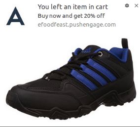
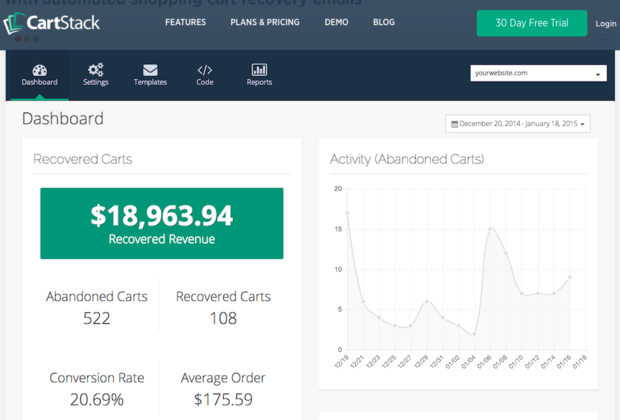
You can also use cart abandoned software like CartStack and make up for lost sales opportunities that your website will inevitably face.
The process is deceptively simple: All it does is that it sends out an easy and inexpensive email reminder to the user. Perhaps, the best part is that it can be seamlessly integrated with any website!
The Takeaway: Every customer – new or returning – is extremely important for your business. In fact, E-Commerce businesses need to pay special attention to the customers that leave midway and try and address their pain-points by constantly being in touch with them via sending emails, custom offers, etc.
Closing Thoughts
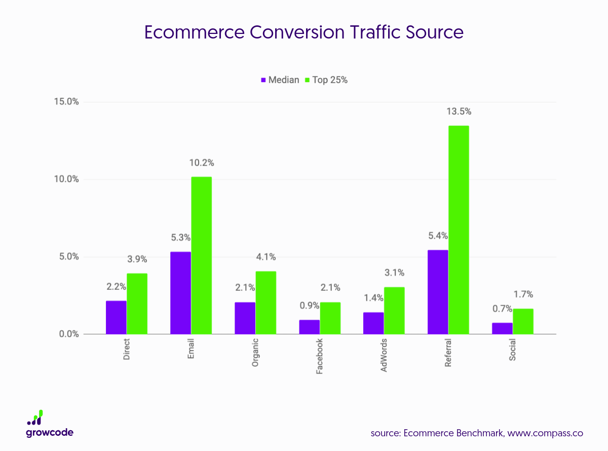
Double-digit conversions rates are unheard of. In fact, data claims that conversion rates typically range between 1-3%. However, adapting to new tools like Web Push Notification has resulted in getting conversion rates up by 10%.
But, there are plenty of tips and best practices you can embrace (as the ones mentioned above) to bridge the gap between your skeptic brand ‘clickers’ and turn them into loyal brand ‘converts.’ Try these and see the difference for yourself. Over and out.
