Looking for some push notification opt in examples you can use?
We get it. It’s really difficult to optimize your push notification opt in without any real examples.
In this article, we’re going to show you 7 great ways to create opt ins that convert really well along with some real life examples.
So, if you were struggling to create custom push notification opt ins, you’re in the right place.
Before we begin, this article is all about examples and ideas you can implement. If you’re looking for step-by-step instructions on different push notification opt ins, you should check out our article on how to configure web push notification opt ins.
Still here? Awesome!
Let’s dive right in.
#1. Safari Style Push Notification Opt In Examples
The most common of push notification opt in examples is the Safari style box.
You probably seen this across multiple sites:
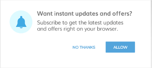
Safari-style boxes pop up at the top of your website. Typically, it’s placed dead center like you see in the image. But, you can place your opt-in to the top-left or top-right of your website as well.
Quick heads up: All Safari style opt-ins are two-step opt-ins. In other words, when a visitor clicks on Allow, they’ll be prompted to confirm their action before they’re actually subscribed.
The great thing about Safari style opt-ins is that they don’t get in the way of your website visitors. They also have a very simple, low-maintenance format.
So, you can set it and forget it like Clio does:

Notice how the opt-in has a really crisp copy that highlights the benefits of opting in for push notifications. That’s a great tip to keep in mind when you’re creating your own opt-in.
#2. Large Safari Style Box Push Notification Opt In Examples
The Large Safari Style Box is exactly what you’d expect it to be. It’s a giant push notification opt in popup that shows up in the center of your website.
Like this one:
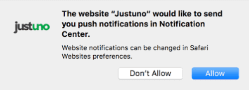
This one converts really well because it’s difficult to ignore.
It’s also pretty easy to get rid of the popup because the Close button is pretty prominent. So, it’s not super-aggressive and doesn’t feel pushy. As a result, website visitors feel pretty comfortable when opting in for push notifications.
Here’s a quick preview of what this looks like in the PushEngage opt-in editor:
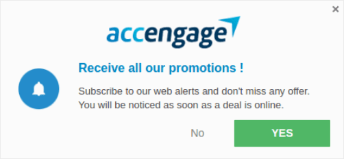
You can customize pretty much anything about the appearance of the opt-in.
#3. Floating Bar Push Notification Opt In Examples
Another popular push notification opt in example is the floating bar opt-in. You know those floating bars at the bottom of the website that ask you to accept and allow cookies?
It’s the same thing, but instead, you’re asking to allow sending push notifications.
Take a look:

The beautiful part about floating bars is that they’re both difficult to miss and difficult to ignore. Typically, a floating bar will block out the content in the lower part of your website until the visitor clicks on either Allow or Close.
While this is a little more aggressive that a Safari style opt-in, floating bars also convert really well.
#4. Bell Placed Bar Push Notification Opt In Examples
Have you ever wished that you could put a bell icon on your website like YouTube does and ask people to “Hit the Bell Icon”?
Well, you can actually do this for bell push notification opt-ins:

You can place the bell icon on either side of the lower half of the display screen:
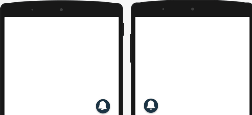
The bell opt-in is the least intrusive of all push notification opt-in popups. So, while you won’t annoy any of your visitors, it’s also easy to overlook the opt-in altogether.
So, you may want to create a push subscription opt-in reminder.
#5. Push Notification Single Opt In Examples
A push single opt-in is essentially a single step opt-in. In other words, these opt-ins don’t ask for confirmation. All your visitors will see is a single prompt to opt in and if they click on Allow, they’re subscribed to your push notifications.
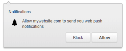
But there’s a small catch. To enable single step opt-ins, you must have:
- An SSL certificate installed on your website
- Access to your server’s root folder
Without these two, you won’t be able to use single step opt-ins.
On the upside, single step opt-ins get a LOT more subscribers than two-step opt-ins. Usually, it’s only people who’re already regular readers of your content that sign up if there are two-step opt-ins on your website. Since a single-step opt-in is simpler, more people end up subscribing to your push notifications than a two-step opt-in.
If you want new visitors to keep subscribing for push notifications, you should check out this article on how to enable single step opt-ins. If you’re more intent on getting regular readers to stay in touch and become paying customers, go for two-step opt-ins instead.
#6. Location + Push Notification Single Opt In Examples
Now that you understand single opt-ins a little bit better, it’s time to up the ante.
You can get permission from your visitors to send them push notifications and get access to their location using a single push notification opt-in. It’s like this opt-in popup:
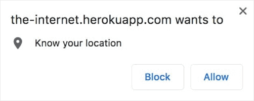
But a combined opt-in requests permissions for both push notifications and your location.
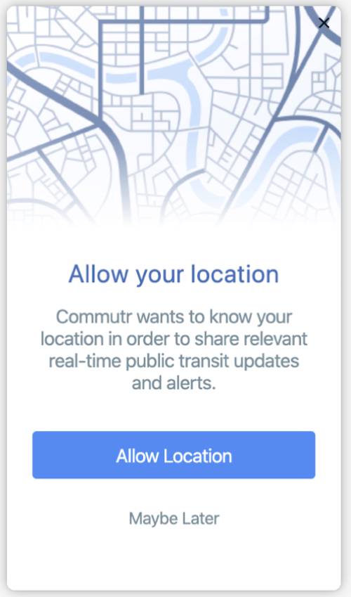
The combined push notification opt-in is super helpful for travel portals, ticket booking and reservation platforms, and even some map-based SaaS products.
Once you get these permissions, you could even send out real-time push notifications to your subscribers!
Sure, this is one of the rarer push notification opt in examples. You would normally see two separate opt-ins for these permissions.
But as Kevin from The Office puts it, “Why waste time say lot word when few word do trick?”

Bad example? Here’s a good one:
#7. Large Safari With Segment Push Notification Opt In Examples
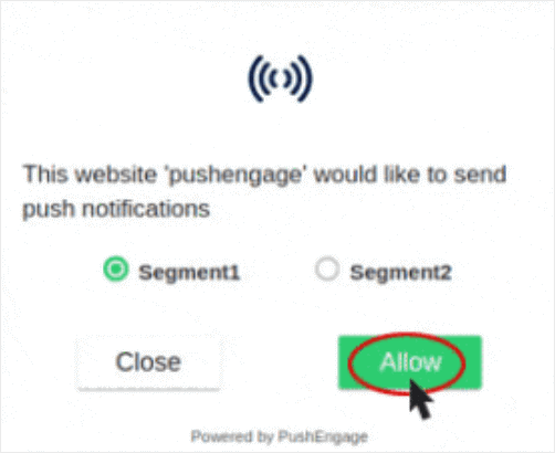
Let’s wrap things up with a call back. That’s right, we’re back to looking at Safari style opt-ins. Only this time, there’s an advanced idea here. We’re going to not only get more subscribers from our push notification opt-in, but segment them by interest as well!
If you’re not sure what segmenting your users is, or why you should be doing it, check out this article on how you can target different audiences with your push notifications. It’s got all the answers you’re looking for.
In the meantime, here’s a sneak peek into what a Large Safari with Segmentation looks like:
Very cool!
Segmenting your subscribers while they opt-in gets you really high opt-in rates because it focuses on what the subscriber wants from you. This method also helps you create extremely targeted and high-performing campaigns later on.
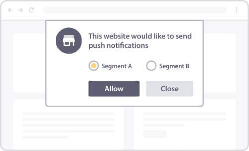
If this sounds interesting to you, you should check out this article on how to segment users during opt-in.
Wrapping Up
That’s all for this one, folks!
Check out this article for step-by-step instructions on different push notification opt-ins.
And if you’re looking to start getting more traffic and get more conversions, you should get started with PushEngage.
PushEngage is the #1 push notification software in the world and you can set up every example in this article using PushEngage. So, if you haven’t already, you should get started with PushEngage right away.
