Looking for the best FAQ pages for some inspiration?
FAQ pages are landing pages that address customer queries in a controlled manner. Creating a FAQ section improves customer experience. At the same time, you can sell your product or service without being pushy.
So, it’s really not surprising that FAQ pages have helped build six-figure businesses. In this article, we’re taking a look at some of the best FAQ pages we could find and breaking down why they’re great. We’ll also show you how to quickly launch your own FAQ page.
Let’s dive right in.
Why Do You Need FAQ Pages?
FAQ pages are great for more than one reason. Yes, they help address sales objections in potential customers. But there’s so much more. If you’ve ever seen a Google search result like this one, you’ll know that FAQs also help with SEO:
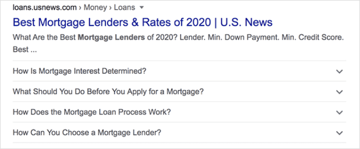
The FAQs snippet in Google search results can bring in direct traffic to your site. The beauty of it is that these questions usually have little to no competition and they end up ranking on the first page.
Of course, there’s more involved than just including FAQs in your content. You need the right Schema Markup for FAQ snippets to be recognized by Google as well. But once you start ranking for the FAQs, you can redirect your traffic from the FAQ page to your product pages.
An FAQ page also shows the customer that you understand their pains and biggest objections. So, once a potential customer lands on the FAQ page, you also end up saving a ton of their time and boosting their trust at the same time.
Pro Tip: Add some form of social proof to your FAQ page without being too aggressive about it. We recommend using TrustPulse to create small popups of social proof that are entirely non-intrusive. You can showcase how many people bought your product in the last 7 days to boost your brand trust even further.

FAQ pages also reduce negative reviews from customers. If you’re already struggling to get more reviews, then the last thing you want is a ton of negative reviews. Redirecting your customers to FAQ pages can help resolve issues without having to raise support tickets or write bad reviews.
What the Best FAQ Pages Have in Common
Before we jump into our list of the best FAQ pages, you should know what we took into consideration for our list:
- Does the FAQ page have a clear structure that’s easy to navigate?
- Are the answers clear and concise?
- Are there links to more comprehensive guides when needed?
- Does the business update the FAQ pages as it grows?
- Is it easy to search and find queries?
- Does the FAQ page include a search bar for users to find answers quickly?
- Is there a call to action for users to buy the product or service?
If you’re just getting started with FAQ pages yourself, you should also consider all these factors before you create one. And if you already have a FAQ page, you should consider updating it so that it follows these best practices.
Best FAQ Pages: Examples and Ideas You Can Steal
Finally, it’s time to check out some real examples from six-figure businesses. Let’s break down each of these pages and figure out what makes them some of the best FAQ pages of all time.
#1. Dropbox
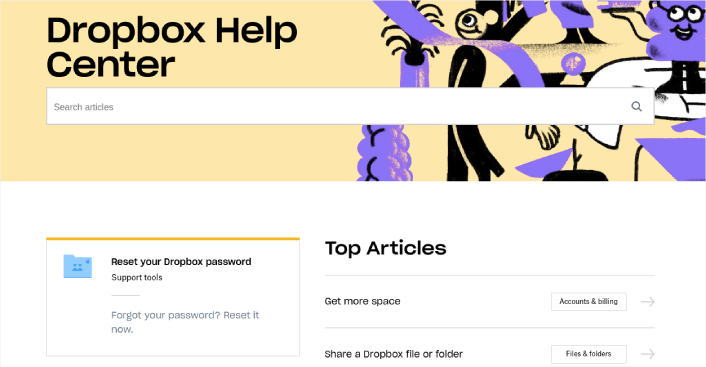
Dropbox is a cloud storage service. To most people out there, that’s not a very exciting product. But Dropbox teaches us all a very important lesson. No matter how boring your product is, your customers and prospects will have questions before they buy your product.
The fun-looking banner is just to stay on-brand with the rest of their site The first thing you see is a search box to instantly find help and documentation. You get answers to the most frequently asked questions up top and links to address other questions.
Overall, this is one of the best FAQ pages because it’s so easy to navigate and everything on the page is meant to be genuinely helpful.
#2. Pinterest
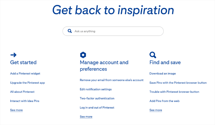
For an image curation platform, Pinterest uses a shockingly minimal FAQ page. You can see the search bar instantly with a very simple prompt. Already, this is a clear win. Search bars are on every alternate site nowadays. To be able to stand out using simple copywriting is always awesome in our books.
Then, you see a list of links to frequently asked questions. Notice how these are all links to detailed articles rather than a few snippets of information. We brought up this point because this is another, very different SEO tactic. The idea isn’t to get into FAQ snippets. Rather, each article ranks for very specifc keywords because they offer deep solutions to specific problems.
And if you scroll further down, you’ll see a list of featured articles that help you learn more about the platform very quickly.
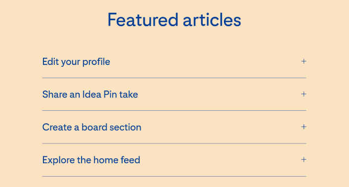
The featured articles are designed to nudge small creators into creaing on Pinterest more often and getting a Business profile on Pinterest. Since Pinterest makes most of its revenue from ads, this makes perfect sense.
At the same time, they also feature a link to their Newsroom to help users discover new features on the platform. A newsroom is a great way to beef up your FAQs page if you’re doing a lot of press releases or releasing new features.
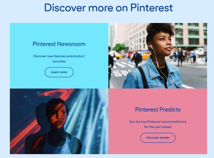
The crown jewel iin the entire page is the link that prompts you to Discover trends. Pinterest is partly a search engine and partly a discovery platform. So, understanding trends can really boost your traffic and engagement rates. At the same time, a lot of these trends come from Pinterest ads.
By publishing this report for free, Pinterest slips in another great reason to create a business account and start spending on ads.
#3. Twitter
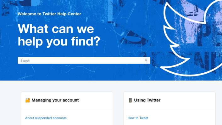
Twitter has always been able to offer a great user experience. So, of course, the Twitter Help Center also does a fantastic job. Again, notice how the FAQs page is mostly a collection of links sorted into different categories for easy access. On top of that, you have a very prominent search bar. The overall design is clean, uniform, and avoids unnecessary distractions.
The common thread between all the FAQ pages so far has been simplicity and ease of use. Your landing page doesn’t have to look fancy to be effective. All you have to do is understand your customer’s concerns deeply and help them get an answer quickly.
We also love the minimal What’s New section.
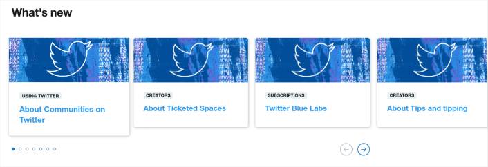
If you’re running a business that frequently updates the product, you can use this idea as well.
#4. Nintendo Switch
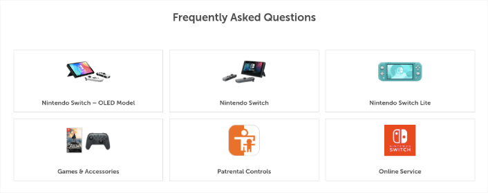
Nintendo has always been a little heavy with graphics across their brand. And they should be. It makes perfect sense for all their sub-brands including the Nintendo Switch.
In their FAQs page, Nintendo Switch uses a very cool way to categorize their FAQs with visual cues. The icons have a custom look and feel to them. So, the users feel important immediately.
Even the navigation menu looks awesome:
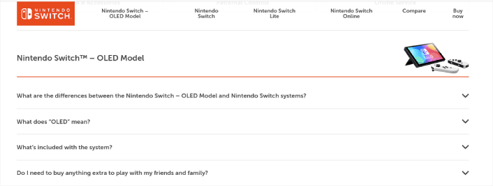
And each section of the FAQs page has accordions with direct answers to their most asked questions. Accordions are great for your FAQ pages. They help you save space, look cool, and optimize for search engines very easily.
Also, did you notice the sneaky little Buy now button in the navigation menu?
#5. Etsy
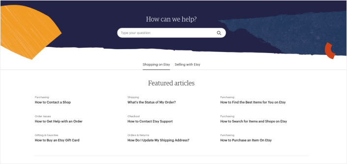
Esty does a great job of creating how-to articles for their FAQs page. Selling on eCommerce marketplaces can be complicated. So, how-to articles are a great fit for your FAQ pages.
Of course, marketplaces like Etsy have two sets of audiences: shoppers and vendors. So, Etsy created separate tabs for both users. We love that a lot too. If there’s one thing we’ve learned from sending push notifications, it’s that segmenting your audience is always a good thing.
The search bar is great too, but what really takes the prize here is that they label each FAQ with a category. That’s what makes this one of the best FAQ pages out there. The labels make the context of the questions really clear. If you have any confusion about whether you’re asking the right questions, the category labels will make it clear if you are.
#6. McDonald’s UK
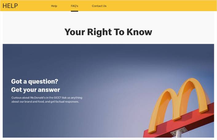
McDonald’s has served more hamburgers than the current world population. Naturally, they’ve dealt with a ton of customers who have different questions about their food. They’ve been in business since April 1994. So, with changing times, they faced entirely different questions. Is it really that surprising that they have one the best FAQ pages ever made?
You can search for a question if you like. As they state on their site, they’ve got the answers for “thousands of questions”. So, you can filter the answers by category as well. It’s just like the Etsy FAQ page. But instead of a label, they use a filter for categories.
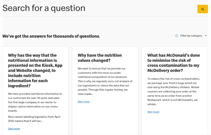
The best part is how mobile-friendly the design is. Customers order everything online using their mobile phones nowadays. So, mobile-friendly landing pages are a big win. Everything is large enough for you to tap on a mobile. And if you have the time, you can even click on the Load More button to see more FAQs.
#7. Lego VIP
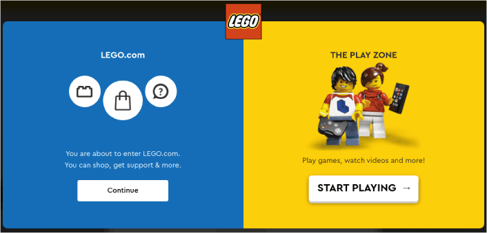
Lego has always championed creativity. So, of course, they flipped the script with their FAQ page.
When the page loads, you get to a popup with two separate calls to action. You can either go to the FAQs page or start playing lego games! The 2 options clearly show that Lego understands its audience wants different things and that they may include children who simply want to have fun.
If you click through to the FAQ page, you get one of the best FAQ pages ever. It checks all our boxes.
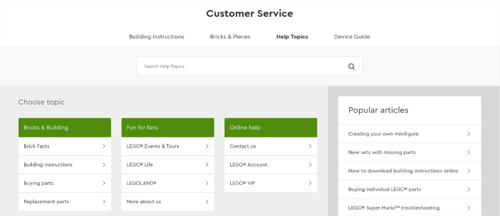
The page also has separate links for different types of users. Again, segmenting your users is always going to help you serve them better.
The coolest part is that it still has a link to the contact page if you need more help. Creating a contact form is a really good idea for your FAQ page. You can also add a live chat option if you like.
All in all, a really great landing page.
#8. Pure App
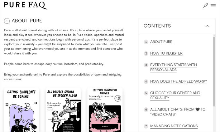
Pure’s FAQ page is super artistic. At the same time, it’s also quite minimal. Most of the content you see on the page is pure text. So, instead of creating a page with a bunch of links, they went all out and wrote their FAQ page like an article.
The topics include information about the app, registering, how it works, and more. Users can either scroll through all the information or jump to a specific section by clicking the table of contents.
It’s very quirky and the only graphic elements on the page are custom digitally drawn cartoons that look super high-end. There are also screenshots that help you explore different parts of the app.
As far as app landing pages go, Pure App has one of the best FAQ pages we’ve seen.
We do think that adding an accordion would be helpful to readers. But the navigation links in the sidebar are quite effective.
#9. Potion
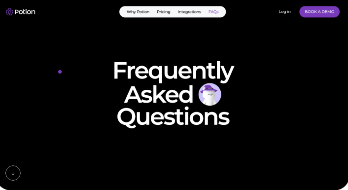
Potion has one of the most over the top FAQ pages on this list. It’s super high-end with a lot of custom code. But the entire look and feel goes very well with their brand. They sell a video creation software that creates extremely engaging videos. So, naturally their landing page had to look sophisticated.
But if you take a closer look, the page is super easy to navigate and the visual cues make it really simple to follow the content.
And yes, they do have an accordion for their FAQs. The font size for their FAQs and answers are extra large so that they’re easy to read. It’s also mobile-friendly. So, you can check out the information no matter what device you’re using.
Most of the questions directly address customer concerns about their product. So, selling their product becomes really easy.
To be clear: You don’t necessarily have to create FAQ pages that look this cool with the custom animations and 3-D artwork. As you’ve already seen, simple landing pages convert just as well.
#10. First Direct
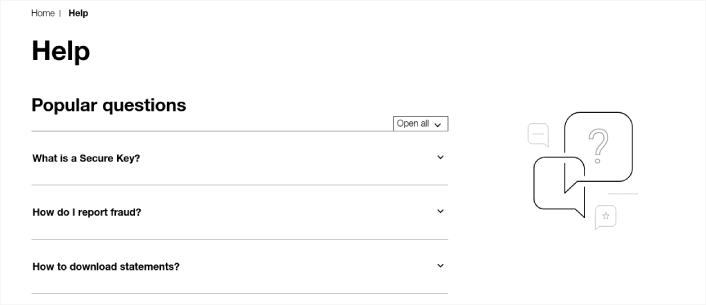
First Direct just proves our point in the last section. There’s nothing fancy about their FAQ page. But it’s extremely efficient and goes straight to the point. The first thing you see is an accordion with a bunch of frequently asked questions.
Each section links to relevant articles that expand on the topic or direct users to more information. In some cases, there are embedded video explainers as well.
There are also multiple internal links that guide readers back towards the sales funnel. In our books, that’s a clear winner.
First Direct is a no-nonsense financial app. And that makes the ultra minimal theme of their FAQ page even more powerful. The only thing we’d recommend here is to have a search bar front and center. But other than that, it’s one the best FAQ pages we’ve ever seen.
#11. Headspace
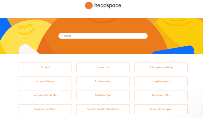
Last but not least is this colorful FAQ page from Headspace. The page is super vibrant and it has really bright, colorful, and fun banner with a search bar on top.
The rest of the page is pretty minimal. They decluttered the entire page and made it a listing page for different categories of help docs. When you click these links, you get redirected to a full-length page that answers specific questions.
Each category page has an accordion with a bunch of questions and answers. It’s like they took Pinterest’s approach and blended it with First Direct’s style to create something entirely different.
The knowledge base offers a simple, easy-to-use experience.
In short: It’s one of the best FAQ pages we’ve seen!
How to Create an FAQ Page in WordPress
Now that you know what kinds of FAQ pages work well, it’s time to create your own FAQ page. The easiest way to add a FAQ page to your WordPress site is with a drag-and-drop page builder plugin. We did a breakdown of the most powerful landing page builders and compared the best in the world.
Our recommendation is that you use SeedProd.
SeedProd is the best website builder for WordPress. It lets you create WordPress themes, landing pages, and flexible layouts for your WordPress site without code.
If you need the quick version of why you should use SeedProd, here it is:
- SeedProd works with any WordPress theme. There’s no messy transition and if you switch themes, you won’t break your landing pages completely.
- The designs are mobile-friendly and you actually get a mobile preview of your page. Seeing as most people use the internet from mobile devices rather than PCs, this is pretty important.
- SeedProd prides itself on being lightning fast and lightweight. So, it’s not going to make your site load slow. And it most definitely won’t consume a ton of your server resources.
For a more detailed look at the features, you should check out our review of SeedProd. With this plugin, you can quickly launch your FAQ pages. The best part is that you can customize your entire page in the visual editor. This saves a lot of time and money you’d otherwise have to spend on custom development.
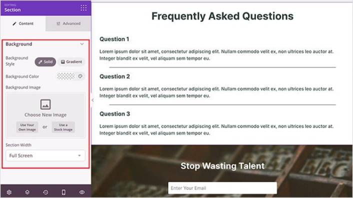
For a detailed tutorial, check out this article on how to create a landing page in WordPress.
What to Do After You Copy One of the Best FAQ Pages
That’s all for this one, folks!
You just learned how to create one of the best FAQ pages of all time. The only challenge you have left is to send traffic to it.
And if you’re looking for an affordable way to grow your traffic, we recommend using push notifications. Push notifications can help you bring in more repeat traffic and site engagement. You can also create automated push notification campaigns that generate sales.
Not convinced? Check out these resources:
- 7 Smart Strategies to Boost Customer Engagement
- Are Push Notifications Effective? 7 Stats + 3 Expert Tips
- How to Set Up Abandoned Cart Push Notifications (Easy Tutorial)
We recommend using PushEngage to create your push notification campaigns. PushEngage is the #1 push notification software in the world. So, if you haven’t already, get started with PushEngage today!
