Are you looking for browse abandonment email examples to get inspired?
Good news: We’ve got quite the collection for you.
The best part is, we’re going to show you how you can double down on your browse abandonment campaigns using both emails and push notifications.
And you can create browse abandonment campaigns for your own website by simply copying these ideas.
Sounds good, right?
Let’s dive in.
- What’s a browse abandonment email?
- Types of Browse Abandonment Campaigns You Can Set Up
- 11 Best Browse Abandonment Email Examples
- How to Create Browse Abandonment Notifications
What’s A Browse Abandonment Email?
A browse abandonment email is an automated email that gets sent out when someone browsing your website decides to bounce without taking any action. Sending the visitor a reminder that they were interested in something on your website can hugely increase your conversion rates.
Browse abandonment campaigns are most commonly used by eCommerce sites. But that’s not to say that a travel portal or a news site (or any website, really) can’t use them.
In fact, we highly recommend using browse abandonment campaigns even if you’re not running an eCommerce site seeing as your competitors won’t be using them!
The best way to look at browse abandonment emails and notifications for eCommerce is to understand how a conversion happens on most eCommerce sites.
A common conversion path taken by most visitors is:
Home Page » Category Page » Product Page » Cart Page » Checkout Page » Order Completion Page.
Now, most users that add a product to their cart never actually buy the product. If you’re seeing the same problem on your site, you should check out this article on how to set up cart abandonment campaigns.
Cart abandonment campaigns are automated campaigns that get triggered when your product is added to the cart. And it really works. You can sell a lot of products using a cart abandonment campaign.
But what about those visitors who only come window shopping and don’t even add a product to their cart?
That’s where browse abandonment campaigns come into play. Using the browse abandonment email examples in this article, you can target, convince, and convert:
- Customers who added a product to a Wishlist, but not their Cart
- Customers who viewed a product more than once
- Customers who browsed more than 3 products in the same category
- Customers who searched the site for a specific product
- Customers who stayed on a product page for at least 3 minutes and didn’t buy
You get the idea.
Essentially, a browse abandonment campaign ends when the customer adds the product to their cart. And then cart abandonment campaigns take over.
Before you get to the examples, let’s check out the different types of browse abandonment campaigns you can set up.
Types of Browse Abandonment Campaigns You Can Set Up
There are 4 basic types of browse abandonment campaigns you can set up:
- Homepage Abandonment
- Category Abandonment
- Product Page Abandonment
- Site Search Abandonment
These are all very straightforward. But they all have specific campaign ideas that work best for each type.
To reduce home page abandonment, you’ll want to send a gentle nudge asking visitors to check out your top-selling products. If your visitors bounce from a category page, send them either top products or new arrivals in that category.
Product abandonment is the easiest to handle. You can either send out a discount or simply send a reminder email or notification. You can even send out a price drop alert.
Site search abandonment can be a little complex to handle. Depending on what the user was searching for, you may want to send out a category page or specific product recommendations or even just the search results page.
You just went through a bunch of different ideas. Time to check out the examples.
11 Best Browse Abandonment Email Examples
We’re finally looking at the examples!
Now, all these will be email examples of browse abandonment campaigns and you can turn all of them into push notifications as well.
We recommend using PushEngage to create your push notifications. PushEngage is the #1 push notifications software in the market, so you’ll be in good hands.
Let’s dive in.
#1. Asos
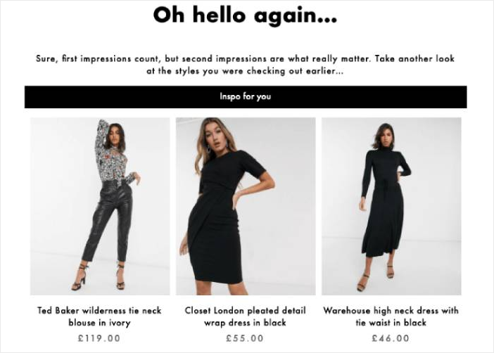
Check out this browse abandonment email example by Asos. It’s a simple campaign triggered by the home page.
As you can see, it’s a simple nudge asking the visitor to check out some of their top products.
#2. Silver Street Jewellers
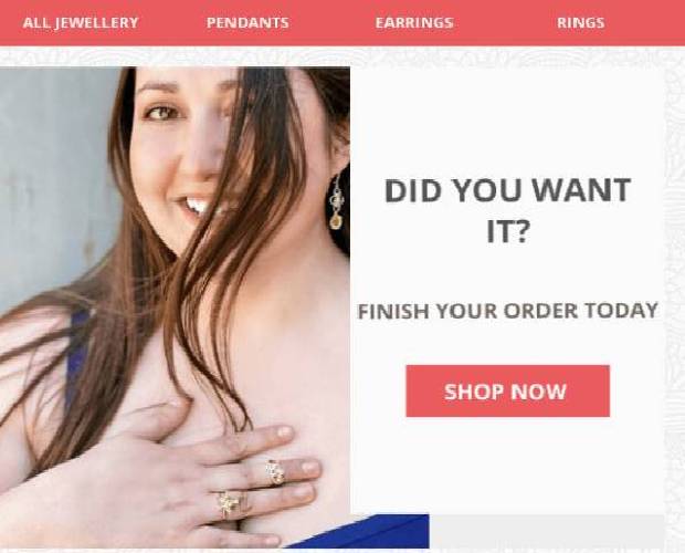
Take a look at this example from Silver Street Jewellers. It’s a product abandonment email, clear and simple. The only thing we’d probably change about this email is the header.
Instead of offering options to check out a hundred more products, we’d recommend sending an email that focuses on just the abandoned product.
This is one of the areas where sending out browse abandonment push notifications can be really effective.
#3. Famous Footwear
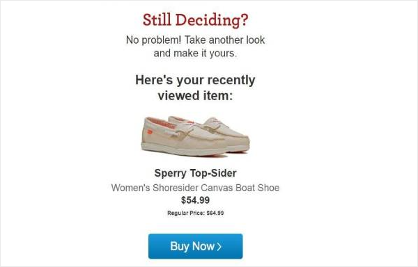
Again, this browse abandonment email example from Famous Footwear is really simple. And you can turn it into a push notification pretty easily.
Check the section about creating call to action buttons and you can create the Buy Now button in less than a minute yourself.
#4. Debenhams
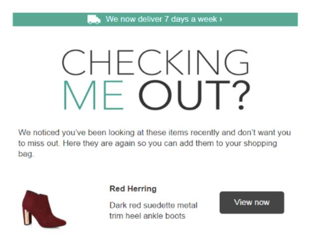
The most incredible part about this browse abandonment email example by Debenhams is the copywriting.
“Checking Me Out?” is incredibly effective and will get you a lot of eyeballs really quickly. We highly recommend using this line as your push notification title for more clicks.
The beautiful part is that you can use it for any and all consumer goods and not just chic ones like shoes.
#5. Target
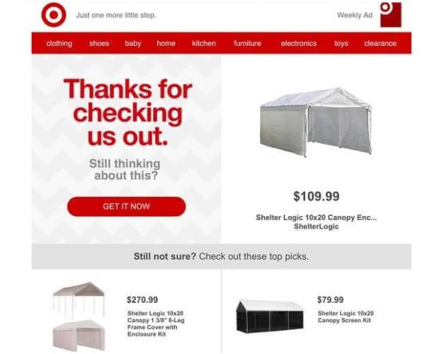
See what we mean about the title in the previous example? Even Target’s using the same idea. It’s just that effective.
Pro-Tip: As you can see here, there’s more than a couple of products in the email. Clearly, this browse abandonment email was triggered from the home page. If that’s where your push campaign gets triggered, you can send out an automated sequence of push notifications.
#6. Ashley Homestore
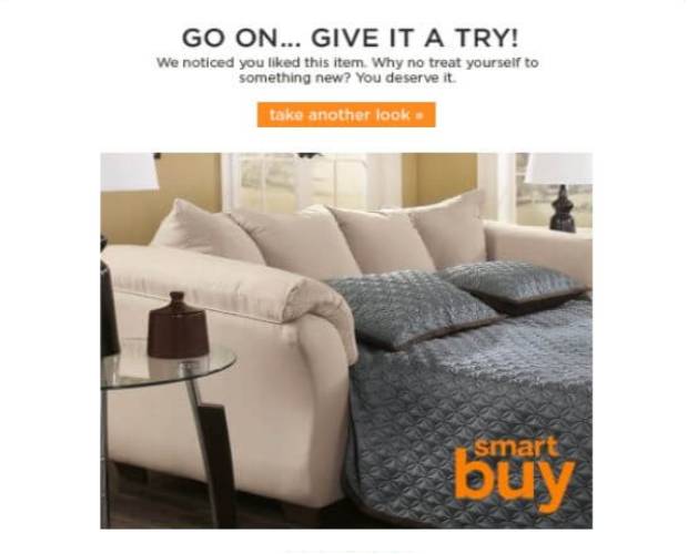
Again, the copywriting on this email is top-shelf. It’s constantly egging you on to try out the product. A nice, juicy image right beneath the message helps you imagine actually using it. Even the call to action button is so innocently put: “take another look”.
There’s nothing sales-y about this at all, but it still works so well.
If you’re selling products in the “Home and Kitchen” category, don’t even think twice about this. Copy this word for word into your push notifications and watch your sales skyrocket.
#7. Timberland
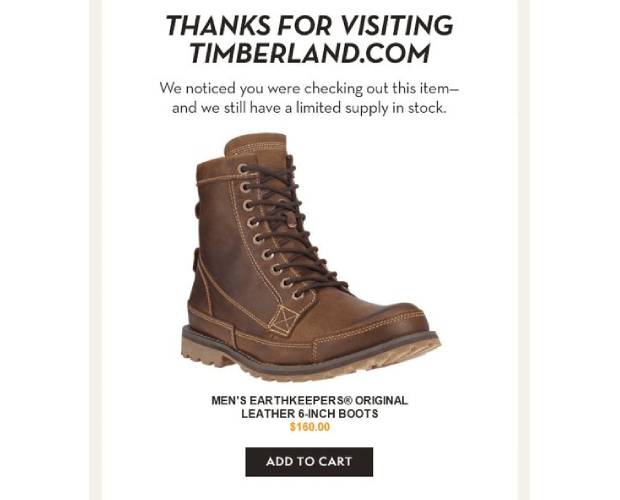
Timberland does a really good job with its options. Unlike other browse abandonment campaigns, we actually appreciate the options here because it’s so well done.
If you take a quick look at the layout of the email, you’ll see that the core focus is the product that the customer checked out. But the options below are either substitutes for the boot or shirts that go well with the original choice.
In other words, this email acts as your personal curator.
And it’s really easy to do because all eCommerce platforms can give you a list of products that “People Also Buy”. These are either alternatives to the original product or compliment the original product.
Very cool.
#8. Waterford
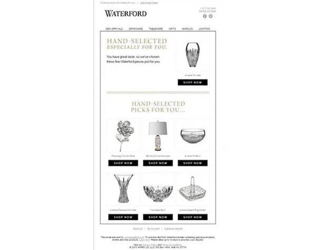
Hey, you. Yes, you. You have great taste!
Feels, great, doesn’t it?
Waterford uses this exact feeling to sell antiques and decorative pieces. The beautiful part is the way in which the email uses recommended products and passes it off as “Hand-selected”.
None of it is “hand-selected”. It’s just an extension of the idea by Timberland. Where Timberland was using products from the “People Also Bought” selection, Waterford is using products from the “Similar Products” selection.
But it feels so great, doesn’t it?
Remember this “personal curator” idea. It’s going to help you sell a ton of products down the line.
#9. Humanscale
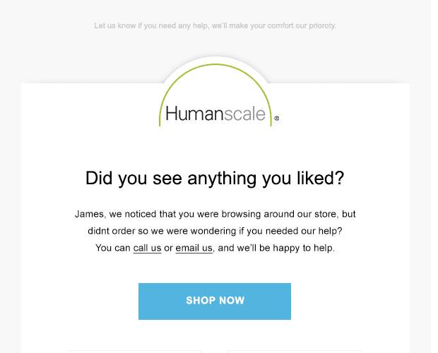
And we’re back to basics with Humanscale. Sorry about the image. This is the best quality we could source. But the idea is really simple. It’s a browse abandonment email example by Humanscale triggered from the home page.
Instead of sending a bunch of random products, Humanscale sent out a list of their bestsellers.
Very smart. Just send the users stuff that gets sold anyway.
#10. Smartwool
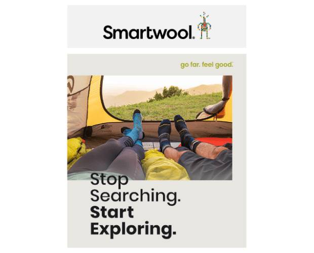
Smartwool did a really good job here. The image is really perfect for a browse abandonment email. It makes even more sense when you take into account that this was triggered by an abandoned site search!
“Stop searching” seems really smart now, doesn’t it?
And just below the banner, you have two product options based on what you were searching for.
Very cool.
We’ll be straight with you. You can create a push notification like this one using PushEngage. But it’s way more advanced than the regular campaigns. You’ll need the PushEngage Javascript API for this one.
#11. Amazon
If Amazon’s doing it, it must be right.
Right?
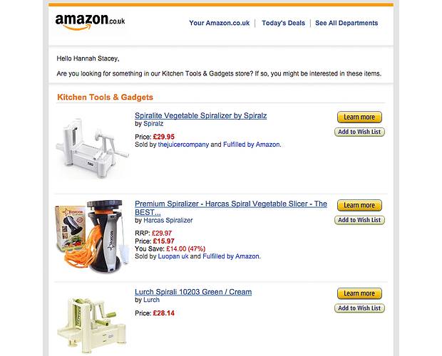
Check out this browse abandonment email example by Amazon where they send out a list of products from the same category.
This is an ideal category abandonment email. If someone browsed a category page and then did nothing at all, send them a notification or email with a list of the highest rated bestsellers in that category.
How to Create Browse Abandonment Notifications
Now that you know what kind of browse abandonment campaign to create, let’s check out how you can double down on your efforts with browse abandonment push notifications.
Step 1: Install PushEngage
Get started with PushEngage today.
Once you select the enterprise package to start using Browse Abandonment campaigns, install the PushEngage plugin to your website. If you’re not running a WordPress or Shopify website, you should check out our guides on installing push notifications on your website.
Step 2: Go to the PushEngage Dashboard
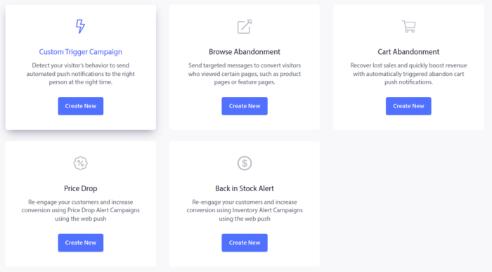
Head over to your PushEngage dashboard and go to Campaign » Triggered Campaigns. Then click on Create New Browse Autoresponder:

And then, select the Browse Abandonment Campaign type from the list of campaign types and click on Create New:
Step 3: Draft the Campaign
By now, you should be able to see a campaign setup dashboard. Create your campaign under Content:
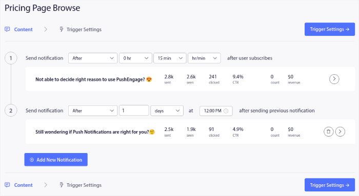
Most of this is straightforward. Give your campaign a name and create a sequence of browse abandonment push notifications. When you’re done, click on Trigger Settings.
Step 4: Set Up Browse Abandonment Triggers
It’s time to set up the trigger for browse abandonment:

These are default values for the browse abandonment campaign template. So, you don’t have to change anything here.
You can set Trigger Limits based on how often you want to send push notifications:

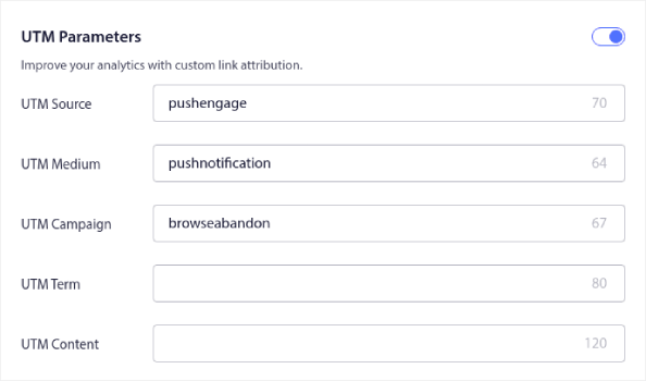
And you can also set up UTM parameters here:
And enable Goal Tracking as well:
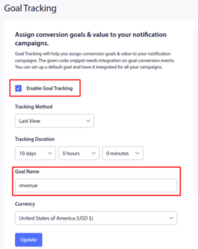
If you’re new to push notification analytics, check out our guide to goal tracking for push notifications.
Step 5: Add the Notification Code Snippet
And finally, go to the list of campaign Your Code button and grab the code for this push notification:
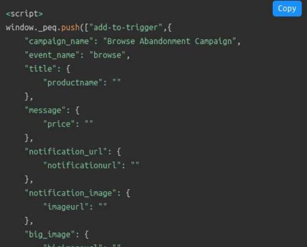
Now, add the variables that you want to add to the code such as the product name, price, and more from your website. And then, paste this code into the website.
That’s it!
You can pretty much replicate any of the browse abandonment email examples you see next and convert them into push notifications. All you have to do is get started with PushEngage today.
Wrapping Up
As we said, a browse abandonment campaign ends when your customers add something to the cart. After that, it’s all up to the cart abandonment campaigns to sell the product.
And if you’re running an eCommerce site, you’ll need to know how to reduce cart abandonment. Otherwise, you’re just leaving a ton of money on the table and walking away. You should also check out this article on different ways to speed up your eCommerce site.
That’s all for this one. We hope that this article helped you set up your own browse abandonment campaigns.
Remember to double down on your browse abandonment emails with push notifications. And if you haven’t already, get started with PushEngage today!
