Think back to your most recent big purchase.
Picture the exact moment you decided to buy. When you clicked that “Add to Cart” button, or booked that discounted flight, or said, “Ok then. Let’s do it!” to the realtor.
I’ll bet you were motivated, at least in part, by a fear of missing out.
In a word, you felt an urgency.
And if you didn’t feel any urgency during your last purchase, I doubt it would take long to think of an example where you did.
Urgency is an incredibly powerful emotion. And it’s one of the most effective tools you have as a marketer.
In this post, we’re going to look at six ways that you can use urgency to boost your conversions. It doesn’t matter if you want to improve e-commerce product pages, landing pages, subscription forms, or anything in between.
What Are Urgency and Scarcity?
So what exactly are urgency and scarcity?
Let’s quickly define each term:
- Urgency – Urgency is an emotion felt by customers when they are given a time-limited opportunity. In a business context, this opportunity might be a product in limited stock, access to free-shipping, or the chance to take advantage of a soon-to-end promotion.
- Scarcity – Scarcity is a state of affairs that creates urgency. When a product is perceived to be scarce, buyers instinctively feel like they might lose out, thus creating a desire to purchase before somebody else does.
The key thing to remember is that urgency and scarcity are two sides of the same coin. You rarely have one without the other.
Anyway, onto the tips:
Display a Cut-Off for Next or Same-Day Delivery
Instant gratification. We’re built to crave it.
Customers want their products as soon as possible. And making it clear that next or same-day delivery is only possible for purchases made before a specific time will prompt customers to buy within that window.
A statement as simple as “Free Delivery for Orders Made Before Tuesday” or “Buy in the Next 5 Hours for Next-Day Delivery” is all that’s needed.
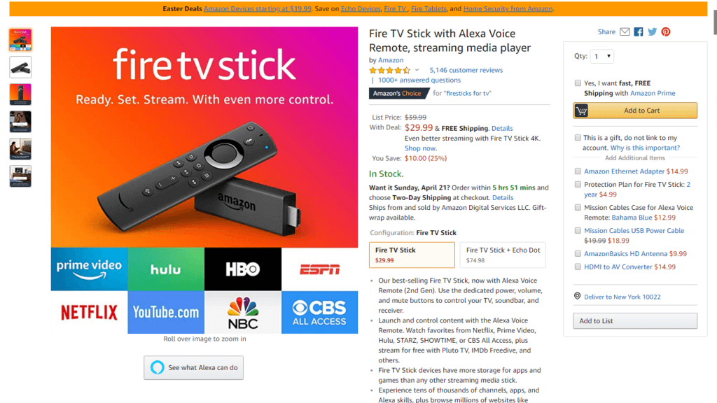
Time-limited delivery is one of the strategies that Amazon use. And it’s difficult to argue with a conversion rate of 13%!
Show Low Stock Levels
“I’ll come back a bit later.”
“I’ll have a little think about it.”
“Maybe I should check some other websites.”
Thoughts like these are anathema to online marketers and retailers.
And potential customers act on these thoughts for one simple reason: they assume there’s an unlimited supply of your products.
Sometimes there is. And it doesn’t really make sense to say that there are 376 items left in stock.
But often you will only have limited stock.
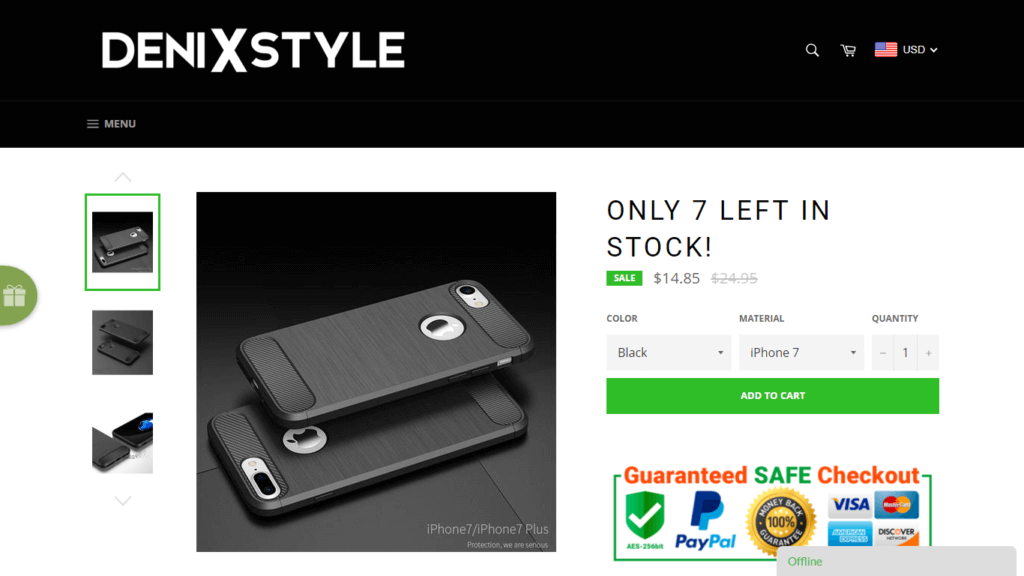
When this is the case, let your visitors know. If there are only three items left, display a notification above the fold, close to the CTA.
Use Push Notifications to Build Urgency
Web Push notifications are a secret weapon when it comes to creating urgency. Build an actionable push notification strategy to build urgency to drive sales for your e-commerce store.
Adding urgency-building elements to your page is all well and good. But you need to get them there in the first place!
And that’s where push notifications come in.
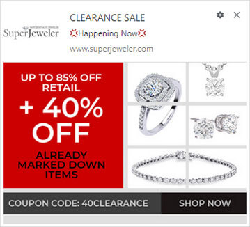
If you’re running a sale or promotion, push notifications are perfect for letting customers know. They’re short, snappy, and can be used to start building urgency right from the get-go.
Ofteria, a company that specializes in offers and promotions, used push notifications to increase repeat users by 39%.
What’s more, push notifications work extremely well in conjunction with other forms of communication. If you’ve just launched a 50%-off sale or free holiday shipping, notifications can be used along with email and social media, ensuring you achieve the highest possible reach. You can even take trial for free push notification service and use.
Show Active Interest
Imagine that you’re in an electronics store. You’re deciding whether or not to buy a new pair of headphones that have taken your fancy.
Suddenly, you overhear someone saying to their friend, “I quite like those headphones. I’m thinking of getting them.”
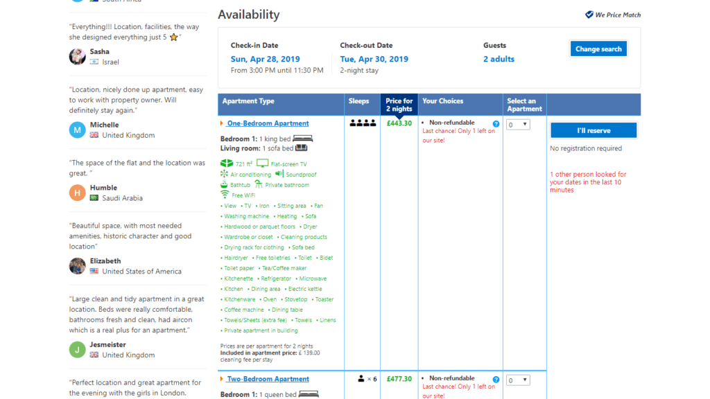
Then, out of the corner of your eye, you see another person at the checkout desk, paying for the same product you’re thinking of getting. Now you’re faced with competition and limited stock!
“Fair enough,” you might be thinking, “but you can’t recreate this experience online, right?” Wrong!
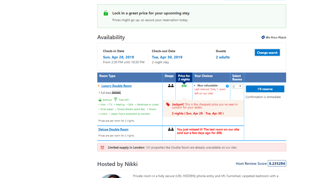
In fact, this is the exact strategy that sites like Booking.com use. They let visitors know how many people are viewing a listing and when a booking or similar booking has just been made.
Offer Holiday Discounts
Research shows that customers are primed to buy during the big holidays like Christmas, Mother’s Day, Valentine’s Day and Easter.
But there’s a caveat. People want bargains.
And the great thing about holiday bargains is that they’re time-limited. That means urgency.
So you’re getting the best of both worlds: willingness to buy coupled with a fear of missing out.
Don’t forget that push notifications are a great way of wishing your customers a happy holiday…with some information about your promotion, of course!
For longer holiday periods, like Christmas, you can even experiment with multiple discounts and offers, that may span just a few days or hours.
- Fall in Love With Countdown Timers
You might think they’re gimmicky and fake. But research shows that countdown timers work. In one study, the inclusion of a countdown timer on a landing page increased conversions by 300%.
One of the reasons that countdown timers work so well is because they are a tangible, instantly-recognizable reminder of the scarcity of an offer or product. You can easily improve e-commerce product pages with a timer to increase conversions.
Furthermore, countdown timers are more adaptable than most people think.
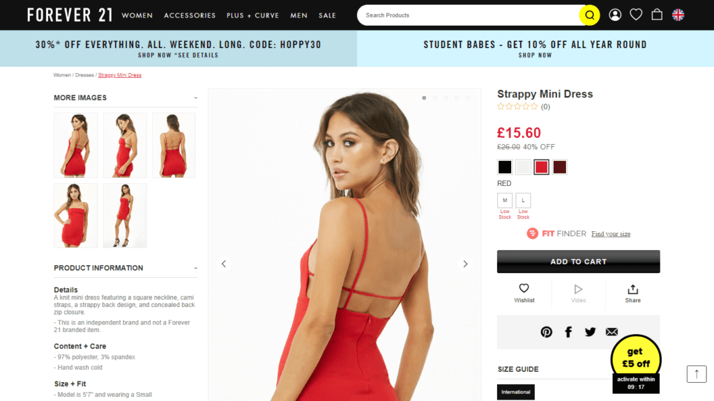
Do you offer a lead magnet or voucher to incentivize people to sign up to your mailing list? Put a time limit on it like it Forever 21 (see the screenshot above). You can use countdown timers for free delivery, sales, discounts and more.
Conclusion
Most of the tips and tactics listed here are simple and easy to implement. But that doesn’t mean that they won’t drive serious results.
There is, however, one absolutely crucial thing to keep in mind. Testing is the only way to find what works for you.
Fortunately, all of these tactics can be tested on product pages with relative ease and speed. And even the more complex page elements – like countdown timers – are easy to implement with plugins. The development cost is relatively very low.
So, time to get to work on your first urgency-building A/B test. The clock’s ticking.