Looking for website welcome message examples you can use?
No worries, we have a collection of the 21 best welcome messages you can use. The beauty of this collection is that these examples are fairly universal in nature. You can use these examples to grow your business even if:
- You’re totally new to creating welcome messages
- You have a small business with a tiny audience
- You want to create welcome messages across different marketing channels
The last one’s especially important to us. A few of these examples may come from emails, but you can take the same idea and apply it to your popups, push notifications, and any other automated marketing campaign you want.
Sounds good? Let’s dive in.
Grow Traffic, Engagement, and Sales With Welcome Push Campaigns
Push notifications are a super effective, low-cost marketing tool to help you grow your repeat traffic, engagement, and sales on autopilot.
Why You Should Use a Website Welcome Message
A website welcome message is a perfect way to re-engage with your audience without being intrusive. Your subscribers will WANT a way to confirm that they’re really subscribed to your emails and push notifications. Creating an automated sequence of welcome push notifications is the perfect way to onboard website visitors.
PushEngage is the #1 push notifications plugin in the world. Get it for free!
We’re going to explore exactly how much you can do with this simple campaign as we go over our examples.
But for now, just know that if you haven’t created your website welcome yet, you really need to start right now. It’s not like you can only use emails and push notifications either. If you’re using popups on your website, you should check out welcome mats.
Time to take a look at the best welcome message examples you can swipe.
Let’s dive in.
Best Website Welcome Message Examples You Can Swipe
Now that you understand why you should be creating a website welcome message, let’s get started with the examples. In this list, we have a bunch of different types of businesses.
We want to be super clear about this one thing before checking out the examples: Your business doesn’t have to be one of the businesses listed here. You don’t have to be that big. Or even be in the same space. A welcome message will be good for your business for any product or service.
Website Welcome Message Push Notifications
Push notifications are a great way to create automated website welcome messages. And if you’re just getting started with push notifications, we recommend getting started with PushEngage.
PushEngage is the #1 push notification software in the world. And it’s super easy to set up welcome notifications using PushEngage. The best part is that you get a ton of proven push notification templates that you can use right out of the box.
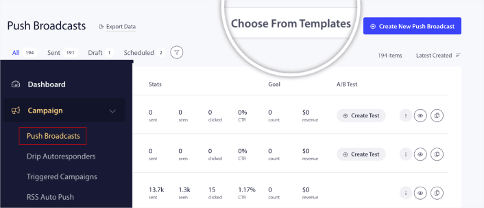
Head over to your PushEngage dashboard and go to Campaign » Push Broadcasts and click on Choose from Templates:
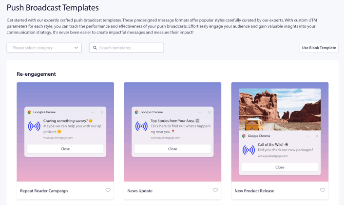
Next, you can select a template to get started with from the library:
Simply hover on any of the templates and click the Use Template button to create a new push broadcast using that template:
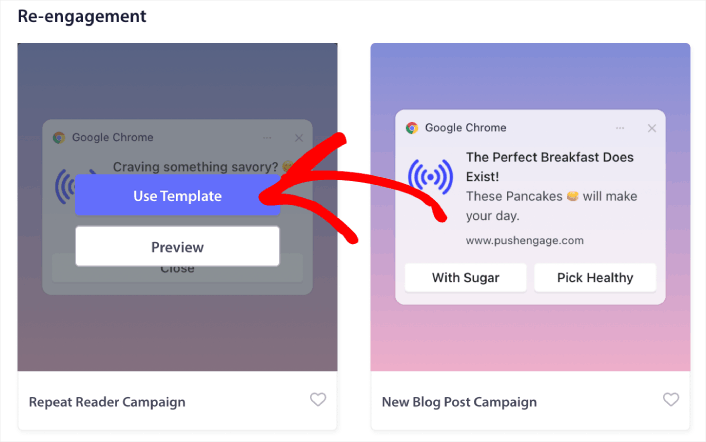
When you use the template, it will automatically fill out all the fields you need to create a new push broadcast by fetching it from the template. Of course, you can edit all the fields to suit your brand more. But you can also send out the broadcast as is if you like. You’ll find all the push notification examples in this article as a template to get started with.
Let’s check out some epic examples now.
#1. Lyft

If you’re selling a product where your customers will only truly understand your value when using it, don’t be shy. Lyft does a great job of prompting first-time users to get started right away.
This is one of the more abstract welcome messages where Lyft treats you like a friend and doesn’t go through the usual process of confirming your subscription. The language is also super comforting and familiar and that makes the notification work so well.
In other words, you need a really good writer to be able to pull this off. If you don’t have a copywriter on your team or if you’re not sure about hiring one any time soon, check out our guide on copywriting for push notifications.
#2. SHEIN
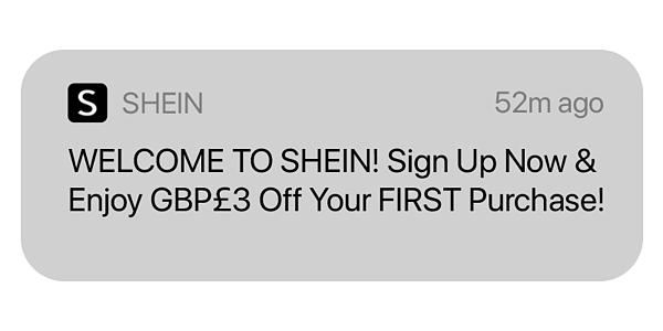
SHEIN takes the idea of getting users started by giving first-time users an actual offer. As a welcome bonus, you get a flat £3 off on your first purchase. Giving your new subscribers a discount, even a small one, is always a good idea. It makes your customers feel wanted and appreciated.
Who doesn’t want that more often in their life?
A minor improvement that we’d suggest here is to use emojis in your welcome notification. Using an emoji can be a really good way to explain your tone.
Pro Tip: Choose your emojis wisely. Do you want to be seen as fun and frivolous? Or empowering?
#3. HelloFresh
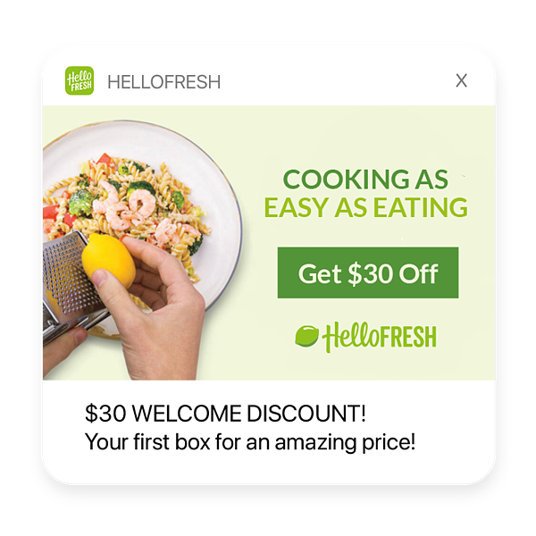
HelloFresh’s website welcome message is the final stage of the evolution! In one push notification, they tell their subscribers what makes them so cool and give their users a $30 discount to help them make a purchase decision.
What makes this notification so great is the way HelloFresh uses a custom image as part of the communication.
A welcome message like this one can not just help increase engagement, but also generate more sales instantly. And we highly recommend using images in your push notifications. The right image can get you way more clicks and sales than a notification with just text.
#4. PushEngage
At PushEngage, we actually have an entire drip campaign to welcome new subscribers.
The second our subscribers create a PushEngage account, we want them to have a quick tutorial so that they can create their first campaign quickly.
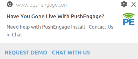
We want you to be able to create the best campaigns ever so that your subscribers can see your value clearly. At the same time, once our customers start using PushEngage, we want to send them ways to increase their campaign performance as well:

And we even send out notifications to help them optimize their optins:
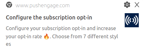
The best part? The entire sequence is automated.
Website Welcome Message Emails
Emails have been proven to be a super-effective way to market to your audience. So, of course, we’re going to look at a bunch of email campaigns right now.
But before you get started with setting up your won website welcome emails, you should get started with an Email Service Provider to automate the entire process. We recommend using Drip to set up automated website welcome emails for your business.
Let’s dive in.
#1. Marketing Sherpa
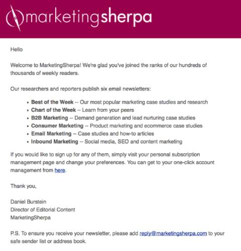
Marketing Sherpa has been an awesome place to learn marketing for a long time now. They do something really cool with their email subscribers. Instead of sending them a bunch of content, Marketing Sherpa sends its users to a list of their content categories to choose from.
If you subscribe to one of their content categories, you’ll only get emails about that kind of content. This takes segmentation to another level. The key takeaway here is to also use audience segmentation to focus your messaging. And there’s no better place to do this than your welcome campaign.
#2. Grammarly
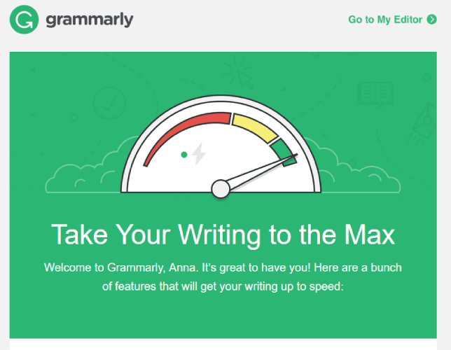
Another great idea for your welcome message is to remind your users why they subscribed to your messages or signed up for your product. Grammarly does an epic job of showcasing their best features in their welcome email. It’s an instant reminder as to why you signed up for the app in the first place.
At the same time, you also get instant insights into where you should get started.
The custom art’s really cool too!
#3. Puma
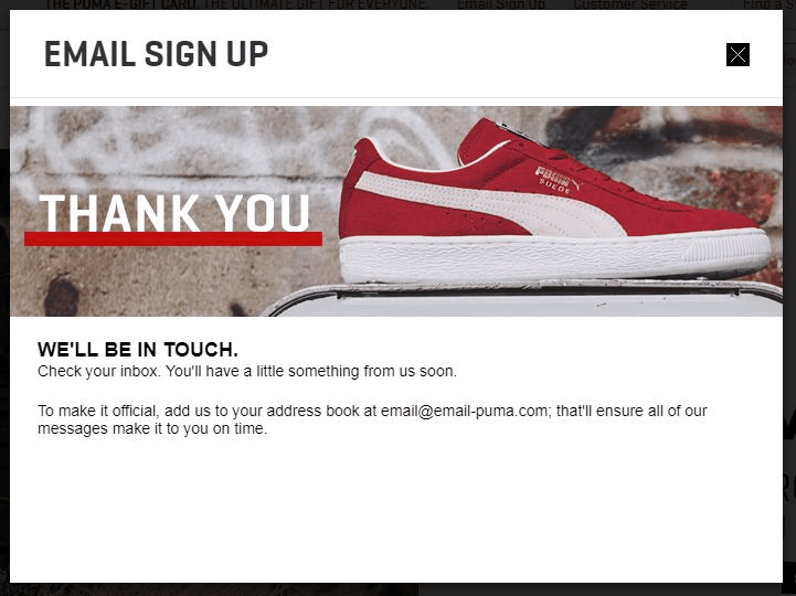
What if you send out messages to your customers and subscribers and they don’t really receive them? Puma removes this problem before it starts by asking their new email subscribers to add the official Puma email ID to their address book.
Smart, right?
You do this, and your emails won’t get stuck in Spam folders anymore.
#4. HelpCrunch
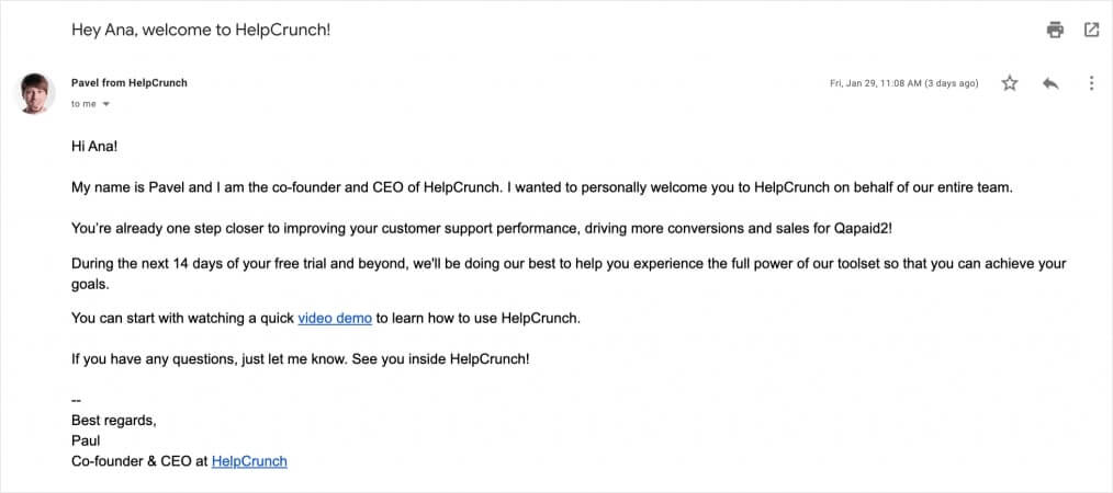
Simplicity sells. Period.
HelpCrunch avoids all the fancy bells and whistles in their onboarding email and still does a great job of coming across as:
- Warm
- Friendly
- Inviting
Does that sound like your brand too? That email’s so good that you can practically use it as a template!
#5. Ralph Lauren
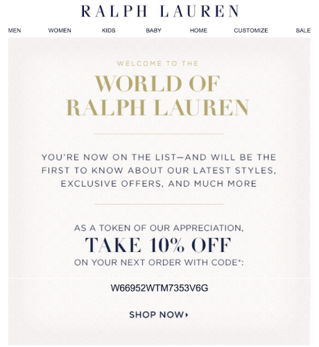
We’re back to the world of welcome discounts. The cool part about this, though, is that Ralph Lauren gives you an actual coupon code to get that discount. This feels super personalized, right?
You can actually do this at scale with a Smart Coupon Generator.
How cool is that?
#6. Brooklinen
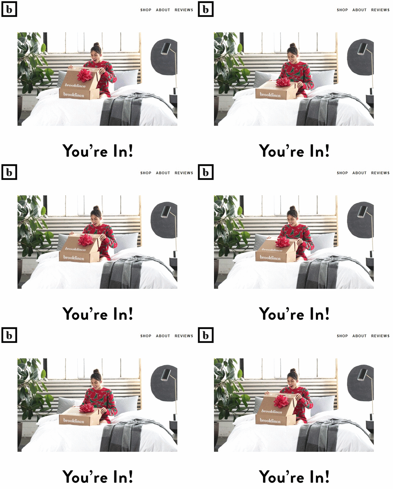
That’s literally it.
Brooklinen’s welcome email is just that GIF and the text that says, “You’re In!”
But can you feel the joy of opening that email? Never underestimate the power of a really simple GIF.
Here’s one for you to enjoy for making it so far:

#7. CamelBak
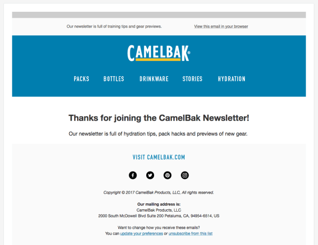
Again, notice how minimalism is a real thing with welcome messages. Just because you have a lot to say doesn’t mean that you should. CamelBak leaves a gentle reminder that they’ve got your back every time you go backpacking!
It’s really that simple.
Oh, and don’t ignore the social media links at the bottom. That’s a nice way to get some more engagement on your social media accounts instantly.
#8. IKEA
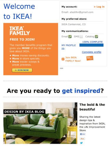
IKEA has always been super focused on being on-brand.
True to their brand, their emails are also all about bits and pieces put together. It’s so meta!
But sometimes being a little meta is good for your brand because it’s a little inside joke with your audience. The beauty of this email is that even though it seems so unorganized, it’s still super effective. Weird, right?
The trick is that they really know their customers well. If you’re ever wondering if your marketing will lead to significant growth, you should check out this guide to creating epic buyer personas.
#9. The Hustle
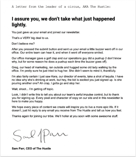
You’ve seen the minimal website welcome messages. Then, there’s The Hustle.
The Hustle has had some of the quirkiest marketing campaigns ever and their onboarding email is no different. The entire email is one massive (for an email) absurdist sketch. In simple words, Sam Parr creates an exaggerated scene just to talk about how excited he is to have you on board. It’s like a scene straight out of ‘The Office’ and it leaves you begging for more.
If you can do that with your subscribers and have them excited to read your next email, you’re going to build a loyal fanbase unlike any of your competitors. We all want that, don’t we?
#10. Miro
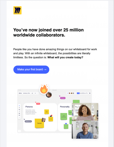
Miro is an online whiteboarding tool that’s built for creators. A huge part of their audience is made up of creative people who need a space to visualize their creations. In their welcome email, Miro does a great job of reinforcing the signup decision.
What does this mean? In simple terms, Miro tells you that you’re now in a world of 25 million other creative people. It’s meant to reinforce in your mind that signing up was a good thing. If you pair this technique with FOMO in your optins, you’re going to get great results.
#11. Customer.io
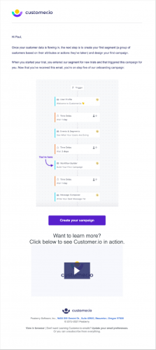
Customer.io does a great job of creating a really fancy-looking welcome message. The flowchart infographic, the embedded video, and the HTML design go together really well and they look amazing. It’s also a great way to make an unforgettable first impression.
But it’s overkill.
If you can create a message like this one, great! But you don’t have to.
Remember: Simplicity sells.
#12. Canva
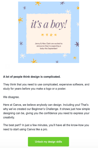
Canva has always been a design-first brand. It’s a designer’s product. But notice, their entire email focuses on introducing you to their Beginner’s Challenge.
This is something we do at PushEngage as well. If you sign up for any of our plans, you get a Beginner’s Challenge inside your dashboard. The idea is to help our customers explore the product and have fun while setting up powerful push notification campaigns.
Here’s the cool part: you don’t need to have a software product for this to work. You can create an onboarding challenge for any business as long as you give your customers enough incentive to participate. It’s great for engagement and you’ll see a spike in repeat customers over time.
#13. Trello
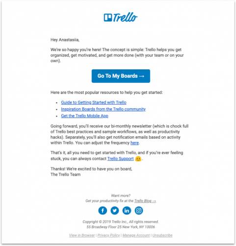
Trello helps you get organized. It’s that simple. So, their welcome message is really simple too.
If you take the time to read it, you’ll see that the email is mostly a list of resources that can help you get started quickly. It’s really a no-nonsense approach and we love it. Everything about that website welcome message is focused on function rather than looking pretty.
There’s absolutely nothing that we’d change here. It’s a textbook example of an onboarding email.
#14. Medium
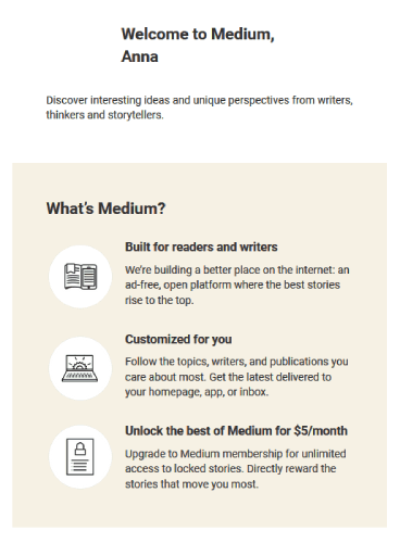
Medium’s welcome message is a direct sales pitch in three bullet points. The blogging platform is super popular. It’s also free to use. The only way Medium makes money is if you buy their premium version.
If you take a closer look at the email, the first bullet point creates an identity that you can associate with easily. In marketing, that’s called defining a ‘tribe’. The second bullet point is all about why you should keep using the free version because even that’s pretty awesome. And the last bullet point is the sales pitch where they establish why you should upgrade right now.
Notice how their sales pitch is around an emotional reason to buy and not a logical reason to buy. It’s the same deal with dating apps and that’s why they make so much money.
But even if your product isn’t an app, you can use this idea if there’s a free sample of your product.
Onsite Website Welcome Messages
You don’t have to create emails and push notifications for a website welcome message. We recommend that you do, but if you’re on a smaller budget, you can simply integrate it into your website.
There are two ways to create welcome messages:
- Create a welcome mat popup
- Redirect to a thank you page when your visitors take some action
If you’re trying to create epic popups with welcome messages you should get started with OptinMonster. OptinMonster is the world’s best conversion optimization toolkit and it’s super easy to create popups to convert more website visitors into email subscribers.
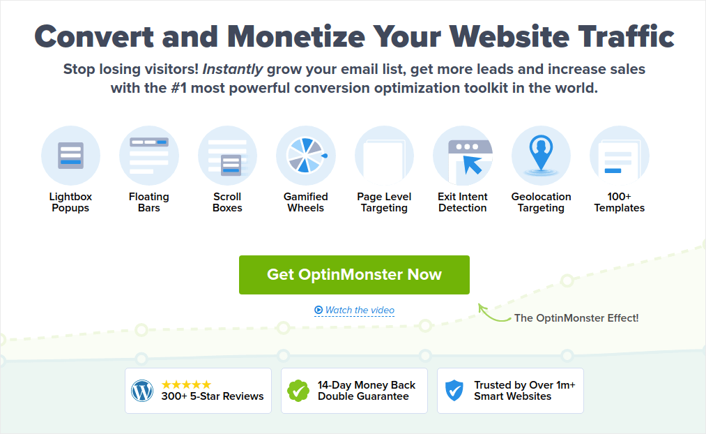
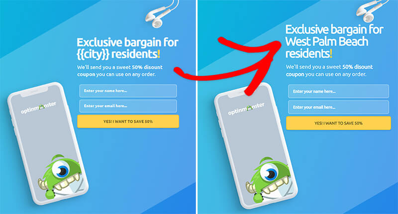
You get a ton of advanced options such as using the visitor’s username, location, dates, and more to personalize your welcome popups. And the best part is that you can target new and returning visitors with different campaigns to convert them in a more organic way.
Here’s an example of the type of personalization we mean here:
If you’d like to take a closer look at the different features, you get started by checking out our review of OptinMonster.
And if you want to create some great thank you pages on your website, you should check out SeedProd. SeedProd is the best WordPress landing page builder. It comes with hundreds of pre-built templates for you to choose from and customize with a visual builder. They even have an epic tutorial on how to create your own thank you page like this one:
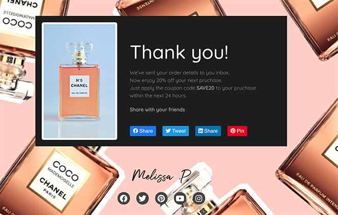
But before you get started, you should also check out our complete review of SeedProd. You’ll be surprised by what you find there, for sure.
Now, let’s look at some examples.
#1. Find Me a Gift
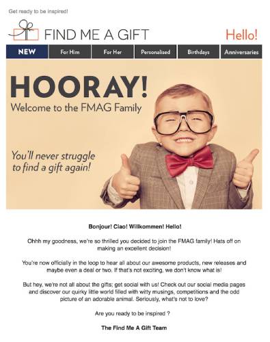
Find Me A Gift is the cutest business ever and their welcome message straight-up wins hearts.
There’s really not much to say here. By now, you already know why this onboarding message is so great. The brand is super social and its welcome message is focused on getting you to socialize with the team. What more could you ask for?
Pro Tip: Ending your messages with a question can be an awesome way to get customers to send you a message. The human brain is wired to find answers to questions. It’s also wired to try and look good in a social setting. Put those two things together and you have a customer that’s dying to interact with you. If you’ve ever seen a live stream on YouTube that’s flooded with Superchats, you’ll know what I mean.
#2. Score
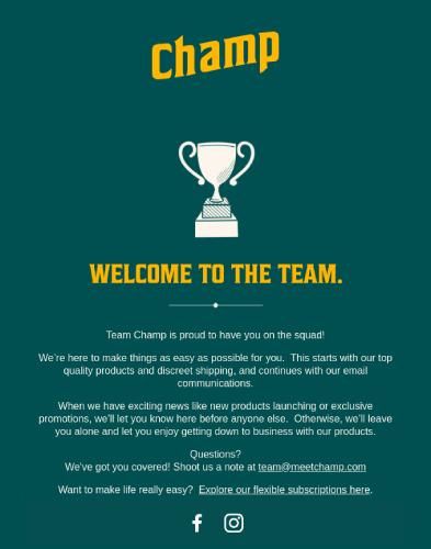
Score does a great job of designing an HTML welcome message. Again, you don’t necessarily have to create an HTML design for your welcome message to be successful. You could just as easily type out a very simple text-only email and be just as successful.
The most important lesson from this example is how you can set clear expectations for the future.
Setting an expectation and delivering on it creates a habit loop in your customers. While this may sound trivial, it’s really not. Think of a daily soap and addictive it can be even though you know that you’ll have to sit through 10 ads to see one episode and then wait for the next one.
Ideally, that’s what you want from your customers too.
#3. Virgin America
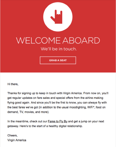
Virgin America has another classic example of an onboarding message. At first glance, the email feels a bit generic. But the more you read it, the more you realize that it’s exactly like Trello’s welcome message. The only major difference is in their tone. Since Virgin is a more service-focused brand, its tone is way more warm and friendly.
Also, this is a thank you page on their site.
You get a quick intro to everything that’s essential and wind up with a simple celebration of you joining their membership.
Feels almost… First Class, doesn’t it?
What to Do After You Set Up a Website Welcome Message
That’s all for this one, folks!
Did you like our examples? Have you ever received even better website welcome messages? Leave a comment below and let us know.
Also, what kind of website welcome messages are you planning to set up?
Our personal recommendation is to start with push notifications. Push notifications are really great tools to increase your engagement and conversions as well.
Not convinced? Check out these resources, then:
- 7 Smart Strategies to Boost Customer Engagement
- Are Push Notifications Effective? 7 Stats + 3 Expert Tips
- How to Set Up Abandoned Cart Push Notifications (Easy Tutorial)
- How to Create a Welcome Push Notification Campaign (Easy)
We recommend using PushEngage to send your push notifications.
PushEngage is the #1 push notification software in the world. So, if you haven’t already, get started with PushEngage today!

Interesting post. I’m glad I found this page. I’m going to save it so I can read any more upcoming posts.
This is a perfect example of quality content. You can tell that alot when into this post. Nice work.
Thanks, Blair. This means a lot to me. If you liked this post, you should also check out this mega list of push campaign ideas.
Finally, a post worth reading. It’s great to find posts like this one.
Hey, thanks! If you liked this one, you should go ahead and set up website welcome emails, push notifications, and popups for your business. Trust me, they WORK!