Looking for a guide to help you navigate browser push UX mistakes?
Push notifications are a great way to improve your site engagement and get a lot of direct sales. But if you try to use browser push notifications that serve a bad user experience, you’ll never see a good return on your investment.
But how do you know what a mistake is? How do you avoid browser push UX mistakes? What if you’ve already made a few of them?
The first part’s simple: If your push notification campaigns are getting low view rates, click rates, and revenue you’ll need to figure out why. If you’re getting low optin rates, that’s a problem too. The good news is that you can always optimize your results.
In this article, we’re going to give you 10 browser push UX mistakes that most people make. Don’t worry if you’ve already made some blunders. We’ll also show you how to avoid these mistakes in the future.
Sounds good? Let’s dive right in.
#1. Asking for Permissions on Page Load
The easiest way to grow your push notification subscriber base is to have a really great optin:
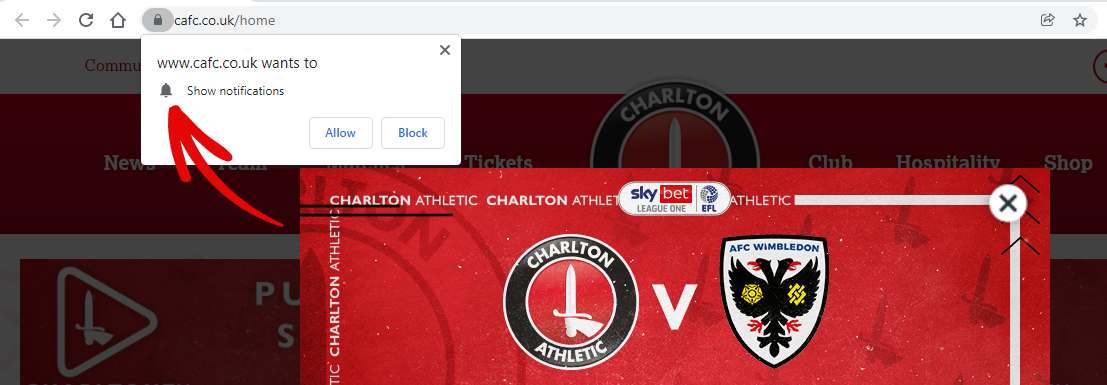
What most people get wrong is showing the optin popup the second a new visitor lands on their site. It doesn’t really matter if you’re running a blog or an eCommerce site. Before asking your visitors to subscribe to your push notifications, you want to give them a good reason to subscribe.
In simple words: You want to offer proper context before showing your visitors an offer of any sort.
A similar idea is to trigger your opt-in popup on page scroll.
For this, you’ll probably want to use Google Analytics to figure out the average scroll depth of your content. If you’re not sure how to do this, check out this article on how to use scroll tracking on WordPress.
The good news is that you can customize your push notification optins to improve your optin rates. We usually recommend that you delay showing the subscription popup. It’s super easy to do, but it’s a really cool way to increase your subscribers without being pushy.
#2. Not Sending Personalized Push Notifications
The last thing you want to do is send irrelevant notifications. Not only is it a great way to waste your marketing budget on messages that will never get clicked but also an easy way to lose your hard-earned subscribers.
What you want to do instead, is to send targeted, personalized push notifications like this one:
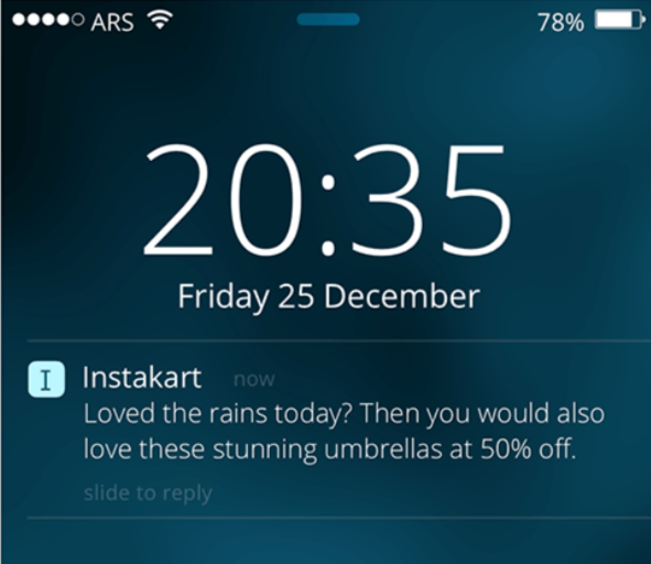
It’s super easy to personalize push notifications and there are loads of different ways to do it. For instance, you can send location-based push notifications to focus on a subscriber segment in a specific location:

Or, you could personalize the message based on when your subscribers receive your notifications:
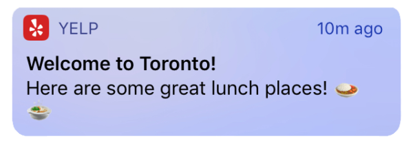
You can personalize your notifications by creating subscriber segments, but we’ll talk about that next.
#3. Bad Subscriber Segments Lead to Bad Browser Push UX
Subscriber segments are groups in your subscriber list that have something in common. The common element can be interest-based, location-based, or any demographic data you like.
The best part is that you can automatically segment your subscribers directly from the optin.
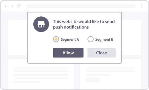
But the biggest issue is creating subscriber segments that help you send relevant content.
So, how do you create good subscriber segments?
An easy and effective way to create great segments is to use the different categories in your content. Let’s say that you’re creating content around home loans and day trading platforms. Not all your subscribers will want to see your content for both these categories. So, you can use these categories as two separate subscriber segments.
Here’s another example:
Let’s say that you’re running a weight loss site where you tell your audience about different types of diets. You shouldn’t send the same person content from three different types of diets. A much smarter thing to do is to create a segment of your subscribers who are only interested in specific content categories.
#4. Sending Too Many Notifications
Browser push notifications are a great way to engage with your website visitors regularly and engagement should always lead to sales. But if you send your subscribers way too many notifications, then you’re not going to see high engagement rates or sales.
Don’t make the mistake of believing that segmenting your customers is all it takes. Even if you send out push notifications only on the kind of content that a subscriber likes, you can’t send them too many notifications.
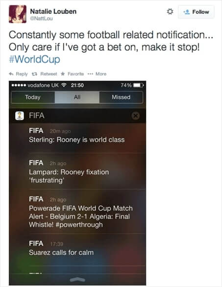
We wrote an article on how many push notifications you should send. If you’re not sure about how many notifications are too many, you should go check out that article.
#5. Not Leveraging eCommerce Campaigns
Push notifications are a great way to sell products directly. The beauty of creating push notification campaigns is that they can be fully automated. We’ve seen so many PushEngage customers use cart abandonment campaigns to boost their revenue by creating one campaign when they first set up their accounts.
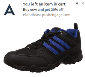
What you want to avoid is trying to push too hard to sell a product. A successful push notification campaign comes from sending the notifications to interested people at the right time with the right offer. And this is a combination of other browser push UX factors.
So, you should definitely use automated eCommerce push notification campaigns to run sales on autopilot. At the same time, make sure that you run a sale without annoying your subscribers.
The right way to run a sale is to make it:
- Urgent: Limit the sale to specific time span and give your subscribers a reason to whip out their wallets
- Useful: Make sure that your subscribers only see offers to products that they’re interested in
- Unique: Try to sell your subscribers something that other vendors simply can’t
If you’re new to automated eCommerce campaigns, you should start with an abandoned cart campaign. An abandoned cart campaign is a great way to generate extra revenue from people who are already interested in a product. When context meets an offer your subscribers will love, you get a ton of extra sales on autopilot.
We’re going to explain how to get even more out of your automated push notifications in the next segments. But you need to start with these basic principles in mind.
Pro Tip: Every time you run a sale, put a daily and weekly cap on the number of push notifications you send. You don’t want to send too many notifications, remember?
#6. Not Listening to Your Subscribers
Ever heard the phrase, “Content is King”?
Yeah, no. The people you serve will always be the King.
That’s exactly why we recommend testing everything about your push notification campaigns. Every push notification has many different components:
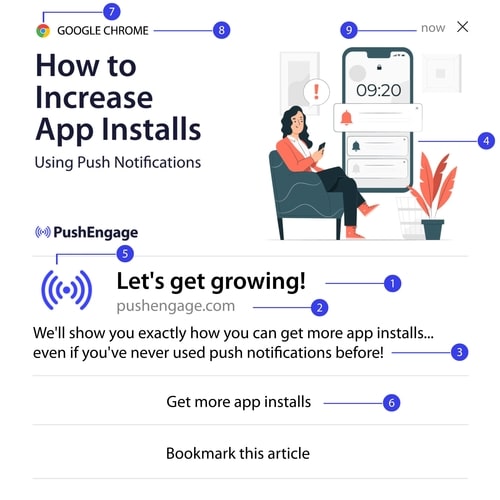
Here’s the epic part: All these parts can be changed and tested.
So, if your subscribers aren’t responding to a particular format, you can always change the format until you hit a sweet spot. This is where A/B testing push notifications can be super useful. A/B testing is the process of testing how effective specific parts of your notifications are and optimizing them over time.
If you’re interested in growing your revenue, A/B testing is your new best friend. We highly recommend A/B testing images, headlines, body copy, and buttons as much as you can before creating automated drip push notifications.
#7. Overpromising + Underdelivering = Bad Browser Push UX
The golden rule of any business is to underpromise and overdeliver. When you think of browser push UX, a common theme in every business is building trust. You always want your subscribers to trust you no matter what niche you’re in.
But most businesses forget that:
Trust = Delight on demand + Predictable results
So, the one thing you can never do is overpromise and underdeliver. How does this tie back to browser push UX?
It’s simple: Loads of businesses use clickbait in their push notifications to get higher open rates. And we highly encourage you to use clickbait…
As long as you can deliver on your promise.
Mashable does a really good job of sending out clickbait notifications:
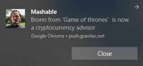
And then, they deliver on it. The cool part is that you can use this idea no matter what niche you’re in or how big your business is.
#8. Sending Push Notifications at the Worst Times
Push notifications can seem super pushy unless you time it right. More importantly, you might be sending push notifications at a time when your subscribers aren’t going to see them because they’re not online. And when they finally come online, your notification gets lost in a sea of other notifications.
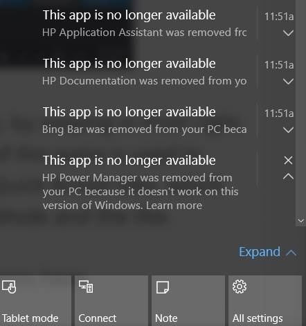
The result is:
- Low view rates
- Low click rates
- High unsubscribe rates
It’s even worse if the offer you’re promoting has already expired.
Happily, there’s a simple way to fix this problem. Just schedule your push notifications to go out at specific times depending on your subscriber’s timezone.
#9. Not Using Character Limits
If you want to offer a good browser push UX, you need to understand character limits for push notifications in different devices, operating systems, and browsers. Typically, the range lies between 40 to 75 characters for titles and 50 to 225 for descriptions.
How disappointing would it be if you sent out a push notification for a really great offer and then your subscribers couldn’t even see the full offer? Ideally, you want to create rich push notifications like this one:

And if you know the right character limited, you can get creative with your push notifcations.
#10. Managing Attention Levels
We’ve already talked about capping the number of push notifications you send. Managing attention levels is about trying to focus on the important notification that week.
For instance, it’s a really good idea to stop sending RSS push notifications when you have other automated campaigns running. Or at the very least, you want to make sure that you’re not sending more than 2 notifications a day or 7 notifications a week.
If you’re running a price drop campaign, you want your subscribers to pay attention to the sales-focused notification rather than a random article on your site.
Wrapping Up
That’s all for this one, folks.
You should head into the PushEngage dashboard now and start creating your own campaigns. PushEngage is the #1 push notifications software in the world. So, your campaigns will be in safe hands.
If you’re just getting started with push notifications, you should check out these tutorials to set up your push notification campaigns:
- 7 High-Converting Push Notification Opt In Examples
- How to Setup Web Push Notifications on Your Website
- How to Convert Subscribers To Buyers Using Web Push Notifications
And if you haven’t already, get started with PushEngage today!
